Can there be anything more soul uplifting than a July sky day of clear blue and white?
The berry path beckons…
the berry path beckons…
Luscious red and purple berries hang amidst thorns and stickers
tempting, teasing,
Further in the bigger, plumper berries dangle in clumps, tantalizing.
How far in will you go to fill your basket?
The briars stripe red across your hands.
The sun swelters long-sleeved arms. Eyes sting from sweat.
The thorns grow thornier; the poison ivy thrives,
and who knows what lurks in the stickery thicket just beyond your boot?
The cool of a wild grape arbor is welcome shade, and scratches are redeemed by buckets filled with berries.
The surprise of unexpected flowers and clouds add joy and sweetness to the burst of berries on a purple tongue.
And to cool the evening, berry dessert on the porch.
These perfect days refresh our souls…
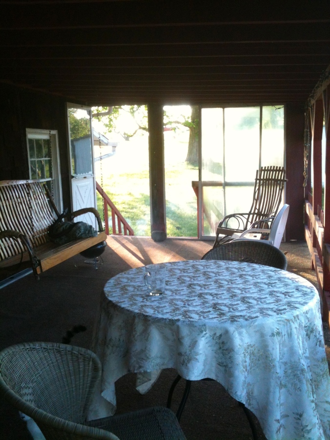
I have a love-hate relationship with our back porch.
It looks over green Pennsylvania woodlands; the birds and beasts are abundant. The five baby groundhogs under our shed are down to three. (This is good — natural predation!) We saw a male turkey spread his fan for his lady, and we listen to the ethereal song of a wood thrush piping in the shadows of evening.
Last weekend the honeysuckle and the wild roses bloomed and the rain brought sweet air. The porch faces east, so sitting on the swing with morning coffee is awe-inspiring; it is easy to be thankful and praise-ful for God the Creator on that porch in the morning.
Four phoebes have made two nests on the porch ceiling, much to the consternation of Henry the cat. The nests are in different corners, so four birds flying in and out is driving him crazy. This nest is above the sliding glass door from our bedroom to the porch. We open and close it hundreds of times a day, much to the consternation of the adult birds. They fly off every single time the door opens. There’s a lot of consternation going on here…
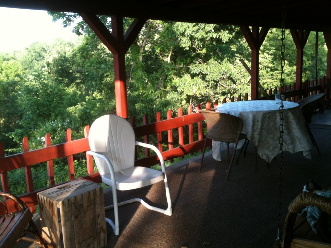
The porch spans the length of the cottage and then turns the corner. Around the corner is my workshop filled with sawhorses and sanding dust. Old paneling (instead of tarps) covers the floor. There is electricity — a porch light, several strings of white lights that come on at dusk, and four plugs for various saws, sanders, and vacuum cleaners.
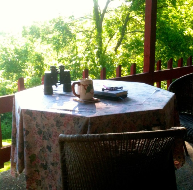
The bar you see in the background was Joe and Clara’s cedar outdoor bar. It’s had some wear and tear over the years, and Henry likes to sleep on the shelves in the back. We are saving it for the cedar planks — the right place for them will turn up soon. The other Phoebe nest is in the far corner of this end of the porch. We haven’t made it back there to check the egg situation yet.
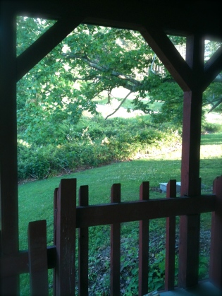
The view from my workshop part of the porch.
So what’s to dislike about this gorgeous porch filled with possibilities?
Vacuum cleaner? Carpet on a porch? Last weekend the edge of the carpet was covered in pollen and maple tree fluff. Seriously covered. I thought I might have to change the sweeper bag in the middle of vacuuming. Three hours later, after a moderate wind blew through — there is always wind on Apple Hill — it looked as if I hadn’t vacuumed at all. I realize that the indoor/outdoor carpet is thirty years old, and is ready to be replaced. But with what? More indoor/outdoor carpet? The colors are not inspiring. I think the best choice is to get a neutral gray and add some area rugs for color. Plus, the idea of vacuuming a porch floor just seems wrong!
Here is the real problem: Under the porch carpet is roofing. This keeps the rain out of Mr. H.C.’s workshop, and there’s no taking it off. Decking is an option, but it is heavy. The porch is ten to twelve feet up in the air at the highest spot on the corner. Sure don’t want any porch collapse disasters.
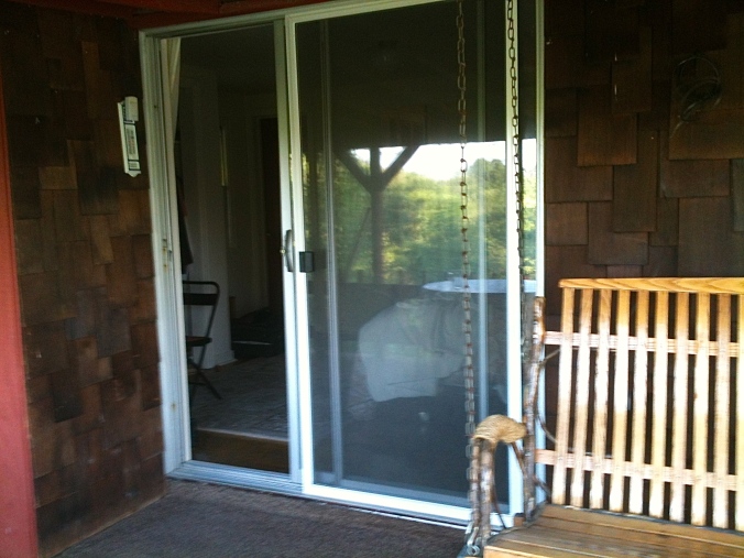
Yes, the sliding glass doors are old and ugly and out of style, but they frame gorgeous sunrises!
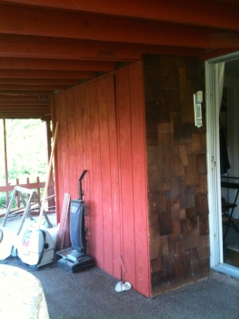
There is also an ugly closet that sticks out. Joe and Clara used it for storage of furniture and cushions. When the house was cleaned after Clara died, inside the closet was the largest hornet’s nest ever known to man. I always open the door cautiously; I’ve never been surprised by anything yet, but I don’t want to be either. I think the closet has to go…
This is the sticking-out closet with the invisible door. Sometimes the vacuum cleaner lives there.
In this picture, you can get a good view of the ceiling, which is painted picnic table red to go with the rest of the porch. It isn’t beautiful, but it would be daunting to paint it any other color. (A similar shade might be acceptable…) And it is very hot on the porch during the mid-afternoon. Mr. H.C. goes around with his laser temperature pointer and says, “Mmmm, Hmmmm. 97 degrees on the ceiling…” That means he wants to insulate it to keep the porch cooler. We are currently arguing about discussing that problem. He wants to do the ceiling; I want to do the floor…
The other problem is the entry-way to the porch from the side yard. I’m not sure what happened, but the stairs are wider than the doorway, and there is a post in the middle of the entrance. The sliding glass doors are facing Northwest — The Weather Side. They are stained and ruined; I hate them. Everything about the entrance bugs me, but Mr. H.C. won’t let me take out the doors until we have something to replace them. He is right that the wind blows through, and we do need some sort of windbreak there. I have seen open porches with windows/doors on the weather side that look good. This one does not.
Notice I didn’t get very close to these slding glass doors. Right next to them is an ugly metal screen door. But you can easily see the post in the middle of the stairway. Oh, I have plans…
This photo is from my Pinterest board on rustic porches (repinned from Houzz.com.) The color is right, the French doors are right, and if you imagine the windows next to the door, you’ll have it. Right next to it is the Design Seeds palette — Rustic hues:
But for now, there is one thing we do agree on: it’s calming and peaceful to have coffee in the morning and plan the day, and it’s calming and peaceful to eat dinner while listening to the birds, watching the wildlife, and counting our blessings.
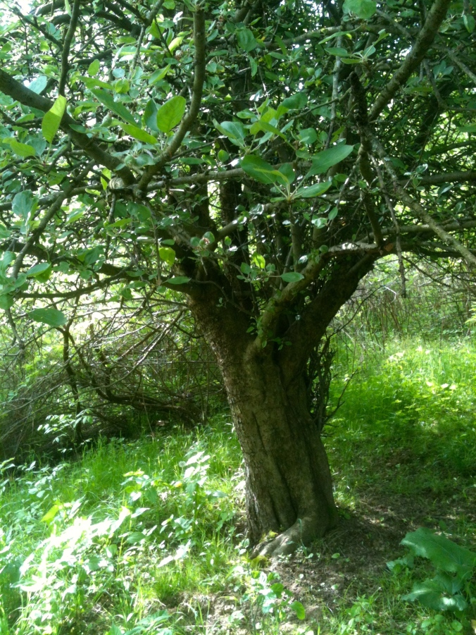
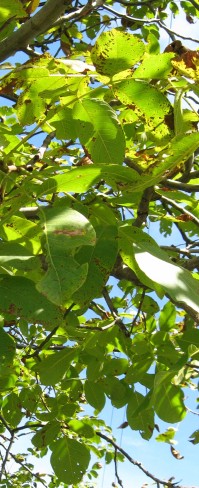
Spring brings such a great variety of green colors that all seem to go together so perfectly.
Outside.
The greens of nature under an apple tree.
Inside, it’s another story — greens don’t always meld together indoors as they do in nature. In the natural world, colors just seem to harmonize; the best color matching is always a close copy of God’s own perfect design.
I learned a new word the other day. Metamerism
Metamerism. (met-TAM-er-ism) It is the effect that light has on color, specifically the type of lighting used to illuminate color and how it affects our perceptions of shades and matching.
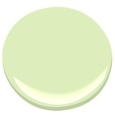
Benjamin Moore Blooming Grove
When I think of color and light I tend to get off topic (see post 15. The Color of Light) because the physics and metaphysics of light, color, and sight is amazing to me. How do I know if the beautiful shade of Blooming Grove green in my kitchen is the same color you see?
I don’t. It all comes down to our eyes and the light.
The varieties of light make colors change. Fluorescent lights, incandescent lights, LEDS, those squiggly bulbs…they all make the same color look different. That’s why decorators tell you to paint a giant swatch in your room. The same color that you love in your north-facing kitchen will look different in the south-facing bedroom. That same color will even change in morning light to afternoon light. Think of the sunlight on the trees and how it changes their colors.
And for another example, look at this photo of the kitchen in the late afternoon sun.
Whose kitchen is this anyway?
The green on the door and the green on the wall are the same, but look how the light has changed the colors. The wall looks yellowish-green because of the sun streaming in the window. And not only the greens, look at the different shades of white on the walls and ceiling that the shadows and sunlight produced. The walls, ceilings, and cabinets are all Sherwin Williams Steamed Milk, though they are different sheens. The sheen of paint –semi-gloss, matte, satin — also affects the color we see because different sheens reflect the light differently. I think (no scientific proof behind this at all) that our eyes adjust to some of this. We see the different shades, yet our brain knows they are the same color.
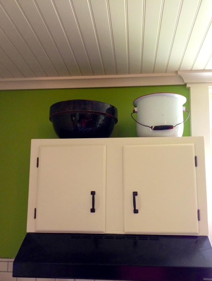
The ceiling and the cabinets and the crown moulding are all painted with Sherwin Williams Steamed Milk.
I’m thinking about colors again because as we are winding down the kitchen project, we find ourselves looking around, wondering what the NEXT BIG PROJECT will be. Granddaughter Olivia voted for the Dining Room/Living Room combo because, as she says, “You walk right from the kitchen into THIS.”
Under construction… and yes, that is a clothes dryer right next to the stove! It’s good for hiding dirty dishes.
See the green wall on the left in the above photo? That is the dining room wall. The Dining Room/Living Room is an upside down L-shape and open to the kitchen. So it matters that the colors in the Dining/Living area co-ordinate with the bold green of the kitchen. I vaguely thought of this once, but now I’m thinking of it more… I don’t want Blooming Grove Green anywhere else in the house, except possibly as an accent in the mudroom. I’ve looked at the next colors down on the color chart from Blooming Grove; Apple Froth is a possibility, but it might be a little, well, frothy…(I do like the name, though.)
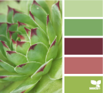
There is a great website for those who love color called Design Seeds. If you’ve never heard of it, definitely click on that link above. I am totally jealous of this idea — I wish I’d thought of it! Here is an example:
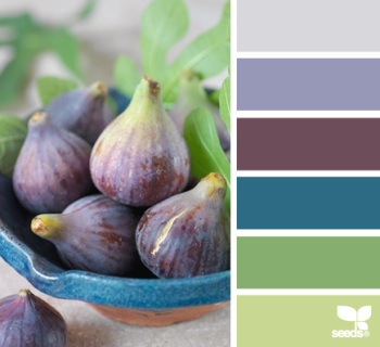
This is called Fig Hues from Design-Seeds. I love these colors, but Mr. H.C. doesn’t like blue…
She takes colorful photographs–from nature, architecture, food, animals — and separates the colors for a palette. Here are four palettes that I particularly like for the living/dining area.
Tropical Greens. All these greens melding in nature — this is what I had in mind. I think the one shade of olive brown would have to be cinnamon though (for our leather couch…)
Planted Hues. Not sure about the light rose color here; it might work with our furniture. We have antiques.
Forest Tones. This is my current favorite. I love how all the greens go together, and there is the rust of our couch in there too.
Bamboo Tones. These three greens are quite nice together and the creamy color is very similar to the off-whites we’ve been using.
And so now, readers, we are doing some audience participation once again. Which of the above palettes is your favorite? Make your choice of the above palette by June 2nd, and, using your best words, say why you like it most. The loveliest worded entry will receive a FREE BOOK on decorating. (I get to pick the winner — it’s my blog after all…) The book is a copy of either Perfect English Farmhouse or Perfect English Cottageboth by Ros Byham Shaw, and you can read my post on these books here. (One of the books belongs to my son-in-law, and he gets first dibs.)
Disclaimers:
Please enter only once.This is a “like-new” book. I read it — hey, if you read my last post, you know why I’m having book giveaways…No one is responsible for this give-away but me, and no one is making any money on it, and I bought the book with good hard-earned money, and I’m paying the postage for the winner to receive it. :-)If you live outside the United States, it doesn’t decrease your chance of winning, but it does seem likely that you won’t get your book as quickly. (My son sent me a postcard from New Zealand in December, and I received it just a few weeks ago in April.)Choose your favorite palette below.
June 4, 2013 Oh, it was so hard to pick the winner — you all had such good comments, and lovely phrases. Thank you each one for commenting, and I wish I had a decorating book to send each of you. Full of Grace-DJ is the winner of Ros Byham Shaw’s book.


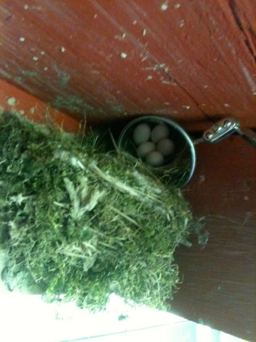 Four phoebes have made two nests on the porch ceiling, much to the consternation of Henry the cat. The nests are in different corners, so four birds flying in and out is driving him crazy. This nest is above the sliding glass door from our bedroom to the porch. We open and close it hundreds of times a day, much to the consternation of the adult birds. They fly off every single time the door opens. There’s a lot of consternation going on here…
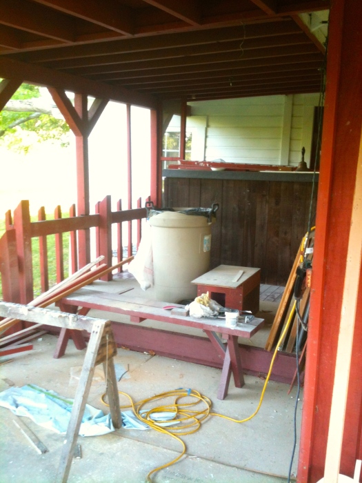


 The varieties of light make colors change. Fluorescent lights, incandescent lights, LEDS, those squiggly bulbs…they all make the same color look different. That’s why decorators tell you to paint a giant swatch in your room. The same color that you love in your north-facing kitchen will look different in the south-facing bedroom. That same color will even change in morning light to afternoon light. Think of the sunlight on the trees and how it changes their colors.
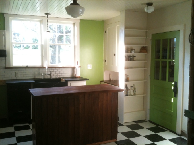

 I’ve looked at the next colors down on the color chart from Blooming Grove; Apple Froth is a possibility, but it might be a little, well, frothy…(I do like the name, though.)