See that 100 up there before the title? I’ve spent the last few weeks wondering what I was going to write about for my 100th post. Big time writer’s block? Afraid of a number? My WordPress statistics tell me I’ve already written 100 posts, it’s just that two of them weren’t numbered. I started the numbering system after the first few posts, because originally? This blog was for me. For us. So we could keep track of what we’d done on the cottage. I wanted an orderly progression of ugly, uglier, better, beautiful. (And heaven knows, something needed to be orderly in my life.)
For a long time, I thought my 100th post would be the Final recap of the kitchen. The Biggie. 100. The Complete Cottage Kitchen Renovation for Less than $10,000.
We did stay under budget, but there are still a few things left to do, and I can’t write a final recap post when the kitchen isn’t final yet.
But I can do everyone’s favorite — Befores and Afters! (Is there anyone who doesn’t like before and after shots???)
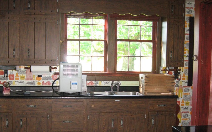
Before.
You can see the sample flooring, but that was the expensive stuff — we bought simple Armstrong VCT.
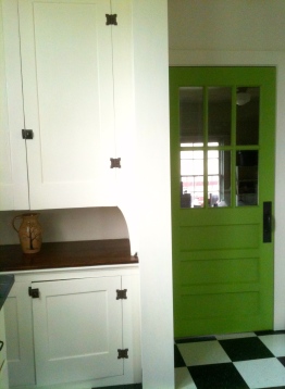
New old door painted Blooming Grove (Ben Moore) from Habitat for Humanity. The lovely creamy white color is Sherwin Williams Steamed Milk

Before…
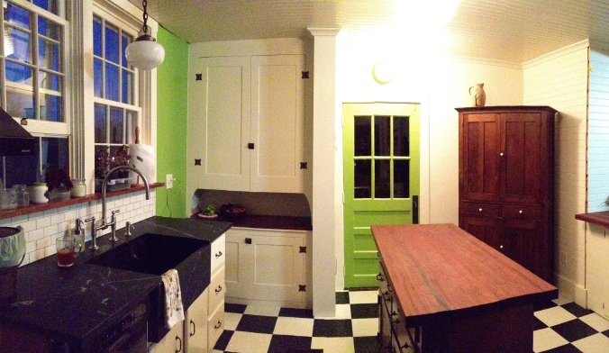
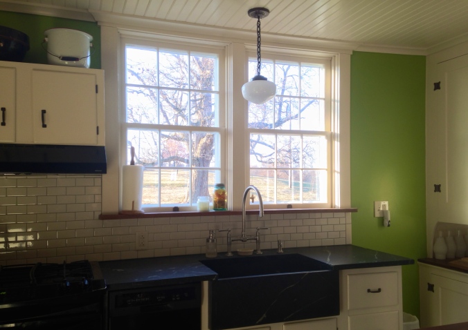
And the same space now…

You can see that the subway tile doesn’t yet go around the corner. And there will be appliance shelves above the tile. Oh and real electric outlets…
This is a close-up of the soapstone countertops and sink. You can read about our soapstone love affair and adventures here.

Even after some nicks and dents and scratches, we still love the soapstone.
This…
…to this!
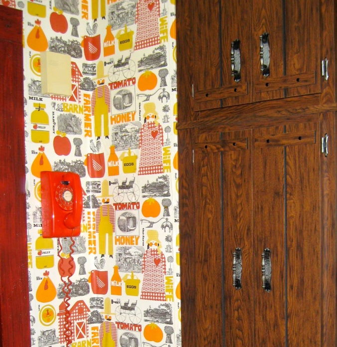
This corner below made it into the recent post about the orange phone. (You can read that one here.)
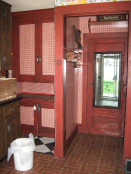
We don’t have any before photos of the little pantry that we demolished — it was just to the right of this door below:


But we do have a lovely shot of the hole that we found when we took out the wall. These next two pics are of the same space — about 16 months apart… I made the first picture small on purpose — no one wants to see how awful it really was.
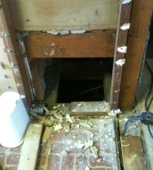
Discovering this was one of the low points…
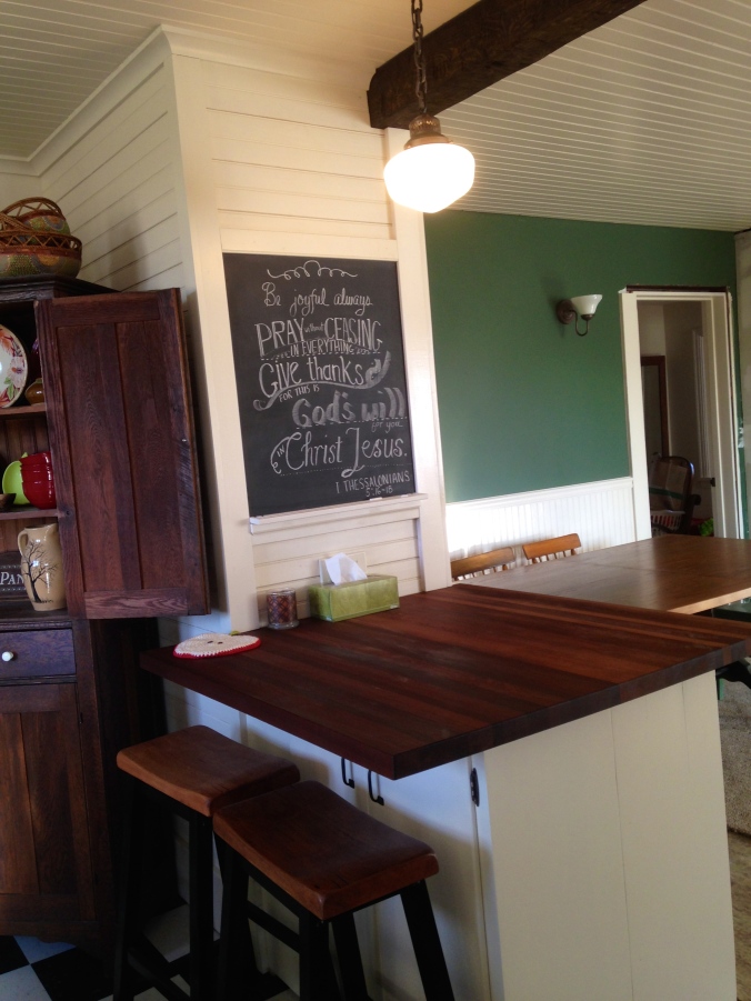
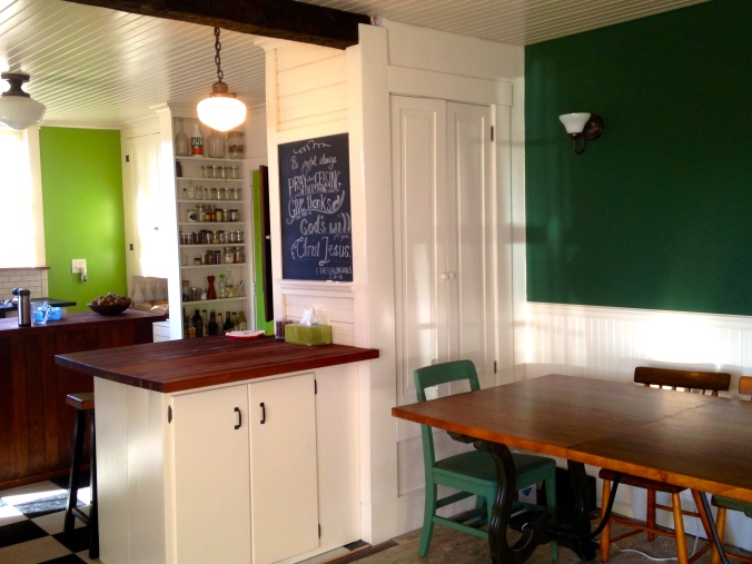
The chalkboard was my Christmas present…And the peninsula covers that hole nicely. The butcher block wood is Sapele from Hardwood Lumber Company in Ohio. You can read about it here and here.
From this above photo you can look in and see the almost finished dining room. You can see that the trim isn’t finished around the door, the crown still needs to be put up (we just finished the ceiling this past weekend!), and the mirror between the sconces still is leaning against the fifth wall… But yes, life is good.

Dining Room before
and what it looks like now.
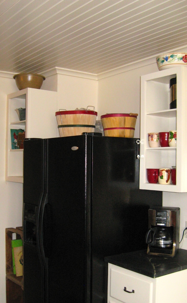
Just a few Post Scripts: Some of the walls you see aren’t there any longer — we took out some half-walls here and there. The only things kept from the original kitchen were the windows, the light with a pull chain above the green door, the fridge, and the built-in cupboard. Oh, and the pantry sign. We’ve still got art to hang, and finishing touches to do, and now that I see the bushel baskets on the fridge, I think they have to go… But it is Apple Hill Cottage after all, so they’ve got to find a place somewhere…

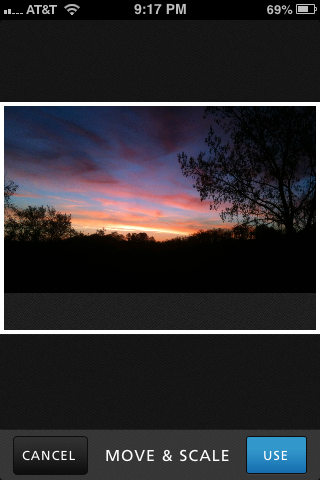 Once you select “use” the fun starts. Just tap the color you want to find first, and that color shows up in a little square. If it isn’t quite the shade you want, move your finger around until you find the shade you like. Then lift your finger, and the color (and its name) appears at the bottom of the screen.
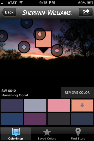 You can save up to eight colors on the screen in a palette. You can also adjust the colors, if you would like to have one color just a little bit lighter, or another color just a bit more intense. Once you have all the colors you like in the palette, save it under a name by tapping on the curved arrow at the top right of the screen. I would save this palette under sunrise, but you can be as creative as you want!
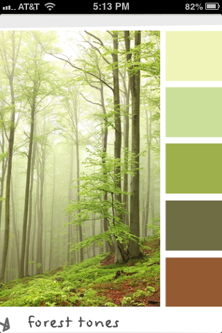
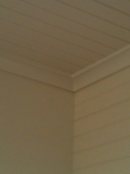 We’ve got some baseboard in finally — no more ugly gray plaster lines! And notice the crown moulding. I only have one thing to say about that. If your husband is doing it, keep out of his way and keep your mouth shut. Okay, that’s two things, I know…