How Can Such a Little House Have Such Big Demands?

We’ve been doing lots of little things on the house of late, but none of them has been post-worthy on its own.

Earlier this spring, Mr. H.C. put bricks under the front windows to finish them.

We also cleaned the brick, took out the old yews, and put in some new landscaping.

IMG_7069

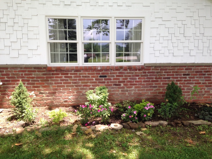
All landscaping plants are deer-resistant. Unfortunately, the sunflowers I planted weren’t rabbit proof…

We updated our outdoor seating — Mr. H.C. put new wood on the seats of these old chairs, and I painted them.

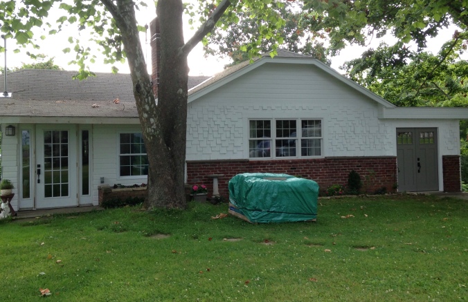
I painted away the last of the blue gray cedar shakes, and Mr. H.C. built an arbor for our grapes inside the garden gate to protect them from the local plant predators.

There’s a new planter for herbs and cherry tomatoes on the sunny side of the back porch; it looks like it has always been there.


We took down the hideous-looking gutter from the front porch and added a nice new face board.

Once that was done, we agreed that the ugly painted plywood ceiling above the porch just wouldn’t do (it was so ugly, I never even took a photo of it…)

…so we gutted the ceiling and replaced it with traditional porch beadboard. It was a great day when that plywood ceiling came down.

But the really exciting news is that last week two trucks from Home Depot delivered a new door, a new window, and roofing materials and shingles. Mr. H.C. was anxious to get started on the roof, so I was surprised one evening when he came in and said, “I really think we should put the door in first. I don’t want it sitting around getting scratched up.”

Replace Sliding Glass Door # 3?  I danced with glee. (There were originally FIVE sets of sliding glass doors in the cottage when we acquired it. Two are gone. Three are now gone! This was Mr. H.C’s project all the way. All I did was pick the doors, the color, help move them across the yard, and shout encouragement from the sidelines.

The project would have gone faster, but like all old cottage projects, one must expect the unexpected. Or, at least, not be surprised. The sill under the sliding glass doors looked like this when we took it out:

IMG_7079 So extra work was involved rebuilding the sill, adding concrete and raising the new doors a bit to make a lovely (and solid) new concrete sill. These doors enter into what is lovingly called the garage bedroom. It used to be the garage. When the inside is finished, it will be the office, a guest bedroom, and the tv room — it’s a small room to be a threefer…

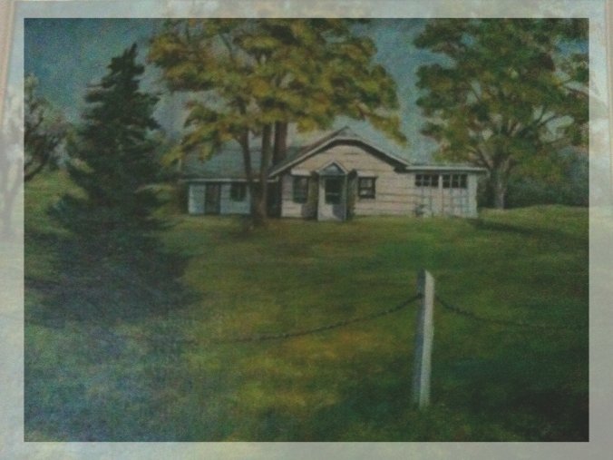
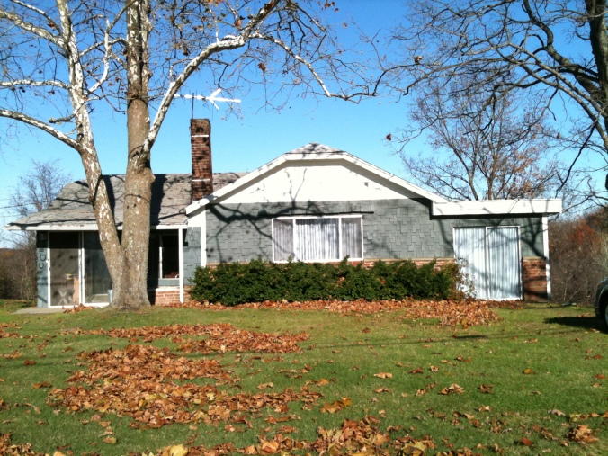
And one more before-and-after shot:

Painting of Apple Hill Cottage, ca.1973

The original cottage in the fifties

applehillfall3.jpg

The remodeled cottage of the seventies

July, 2016

July, 2016, with still plenty of projects to complete

Excuse the green-tarped package in the center of the yard. That’s the next old-cottage project.

On to the roof…

roofing in the dark to beat tomorrow's rain

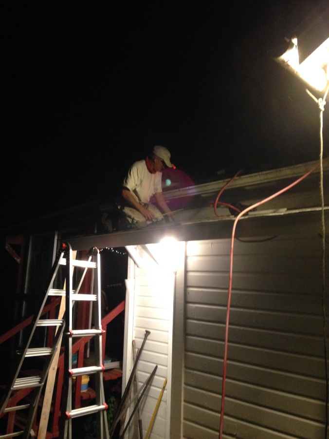
Yup, we work 24/7 around here…


143. All the Gray Is Gone…

Just when I think I’m going to post about the new back porch that is finished just in time for September (it’s not);

Or the new door that we’ve found to replace sliding glass door #3 (we haven’t);

Mr. H.C. surprises me by saying, “Let’s do the front of the house.”

He must have read my post a month or so ago, when I listed all the projects that need to occur for the front of the house to look good better. (See post 136.)

New windowsThis is the cottage up until two days ago. (Uhmmm — the way it’s looked for the last two years. Just let me say that the front looks WAY better than the back.) So with the red brick, the faded blue gray cedar shakes, and the white clapboard siding, there was just way too much going on. Sort of a stripey effect, don’t you think?

I’m actually favoring the colors of white, red, and gray; but in a google image search for “white cottage red trim” this is the first image that showed up:

old_kurtz_house
Please pardon me, if this is your house, but it’s not at all what I have in mind for the cottage. Though it does look about like the color of red that is our back porch — Segovia Red — this color right here:

Back porch rails and ceiling, newly painted

Back porch rails and ceiling, newly painted

The back porch color can be seen from both sides of the house as one drives down (or up) the road. So it counts.

I always thought when we did the exterior of the cottage, that we would try to emulate what it looked like in the forties; but we can’t really.

Back then it was white with forties green trim.

The roof was green, now it’s gray, and it will stay that color when we put on the new roof (next year?).

There was not a red back porch.

And there was no brick on the front. I’ve looked at photos of white houses with dark green and red trim, and no, I don’t want a Christmas house.

Here’s what we have now:

apple hill cottage, newly painted

Neither of us are used to seeing it without the gray. Mr. H.C. thinks it might be too much white. I was originally thinking of whitewashing the brick, but now I’m thinking yes, that might be too much white…

The sliding glass doors will be replaced sometime before winter with doors that look something like this:

IMG_6391

There hasn’t been an interactive post on this blog for awhile, so here is your chance:

  1. Should we paint the brick? If so, what color of gray? :-) (Maybe if we paint the doors red, it will tie in the brick color?
  2. What about door colors? Both front doors can be painted. (Keep in mind that the back porch is Segovia Red, and one can see the porch from both sides of the house.)
  3. What do you think about shutters? Mr. H.C. brought that up the other day, just as I had been thinking about them too. But I have an aversion to shutters that don’t fit the windows, and that’s a 3-window series there in the front… I’m thinking more along the lines of flower boxes under those 3 front windows. What do you think — flower boxes or shutters or neither?

I’d like to hear your thoughts, dear readers. Of course, then we’ll do what we want anyway — whatever that might be…

Here are some more shots to get you thinking…

141. A Rant: How Can Color Go Out-of-Style?

Editor’s Note: The writer has never in her adult life claimed to be in style or cared about being in style. Yet, like everyone who has eyes and ears, the writer is affected by what she sees, so in that case, we are all affected by what is in style, whether we want to be (or care) or not. 

This post has been swirling around in my head and on my computer for months. It’s been edited and re-edited. Mostly it just irritates me that there are Colors of the Year. Indeed, how can a color go in and out of style?

ColorWheelJewel tones? lush emerald, dark ruby red, and midnight blue. Beautiful always, yes?

Nature tones? pine green, autumn rust, walnut brown? Beautiful always, yes?

Brights? sunny yellow, lime green, sky blue? Beautiful always, yes?

Designers and style companies tell us that the number one way to sell your house faster is to get rid of those “out-of-style” paint colors and “do fresh.” Shabbiness and fading aside, I’d just like to point out that the colors we’re being told to paint over now, are the colors we were told to paint then.

Earlier this year (when we still had a house on the real estate market) Zillow sent me an article called Top 5 Home Design Trends of 2015. I don’t know why I read it; curiosity, I guess. But it just irritated me greatly. (Judging from the comments, this was true for many people…) So in case, you care about such things, midnight blue is in, coral and other Bright Colors are out — according to this particular designer. I’m not sure how she could proclaim that coral is out, but she did. Perhaps it is now called Melon?

A few years ago I remember reading that the new bright colors reflected the happy, positive mood of consumers. I guess we’re not happy any longer… (I’m very glad that Midnight Blue is back in, though. I painted a dining room wall that color in 1982; I loved it then, and I still love that color now.)

About fifteen years ago my daughter wanted a mint green formal for the senior prom. We went to every JoAnn Fabric store in Western PA (and there are a lot!) until finally some nice clerk at the fabric counter took pity on me. No, she told us. You can’t get that color this year. It just isn’t being made. You can get this pretty celery green, instead?

This is just one of the RGB charts available from My Practical Skills, a design student's dream site.

This is just one of the RGB color charts available from My Practical Skills, a design student’s dream site. Can you pick the shades that are in style?

Yes, we can’t have everything all the time, but for ten years I looked for deep forest green accessories to go with a rug — pillows, curtains, fabric, bedspread — anything!

Nothing — that’s what I found. So if a color is not “in” just wait ten years until your rug wears out…

Yes, there are way more important issues in the world, but isn’t this symptomatic of our Western culture of materialism? Planned obsolescence — if the color is out-of-style then we’re likely to replace it, aren’t we? That deep, dark green that is the color of pine trees? Out? Outre? Not available? Because a bunch of industry leaders in a board room got together and decreed it, so they can sell more stuff in a different “updated” shade of green?

In my humble opinion :-) color should not be associated with in style or out-of-style. If you want to call my shirt or my couch or my lamp out of fashion, fine. But leave color out of it.

I found the tablecloth below– unopened in its original package — in an antique store last fall. I loved the colors, and they go in my dining room perfectly. I know that the tablecloth is probably out, but I. Don’t. Care. It’s perfect, and I smile every time I put it on the table. Isn’t that what color is about?

And the color on my dining room wall?

Yep, I still love that deep forest green of pine trees. Only now it’s back in. Just don’t call it Forest Green.