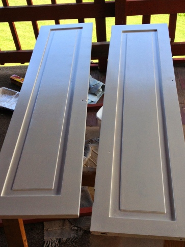
I’ve been painting lots of wood lately. Doors, cabinets, woodwork… I love paint. I love color. But I also love wood.
Paint and color and wood can co-exist, but finding that perfect balance is difficult. Rooms with too much wood need color for drama; rooms with too much color scream out for wood to give rest to the eyes. It’s that perfect balance that makes us all sigh and sit down in comfort.
Mr. H.C., the carpenter, hates to paint wood. “When wood is painted, it’s painted,” he says. “And only a huge effort can get it back to its original state, and even then, it might not look good.” (For a very funny post on men and painting wood, read The Decorologist’s post, Why Men Fear Painting Wood)
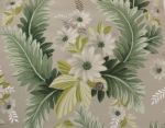
When I was about fifteen, my mom and dad undertook the making over of the basement in our fifties ranch house. They were on a shoestring budget, but they wanted a room where their teenaged daughters could hang out with their friends. It was a gigantic room — just putting carpet on the floor, a dropped ceiling, a big comfy couch, and room dividers at the ends probably put them over-budget. So Mom was gathering furniture from every attic and garage that she could find. Two of her scores were pretty little washstands. She painted one late-sixties orange. As she was preparing to paint the other (late sixties chartreuse) I stepped in. In my fifteen-year-old wisdom I said, “Mom, why are you painting that pretty washstand? You should never paint wood furniture.”
She gathered together all her parental wisdom and said, “When you’re older, you’ll understand.”
In the infinite circle of life, twenty-five years after she painted it chartreuse, I inherited this charming little washstand. It was still chartreuse. I took it to the local stripper and told him I would pay him well if he could take that paint off for me. A few days later he called me back. “Was this painted in the late sixties?” he asked. “And then maybe antiqued?”
 It absolutely was.
“Yeah,” he said. “That stuff just can’t be stripped off.” He sanded the door and then gave up. His advice? “Just paint it. It’s only poplar.” So I painted it early-nineties blue and stenciled it with early-nineties flower stencils. And now, twenty years later, it is relegated to holding craft supplies in my upstairs craft room that is not open to the public.
So many pieces of beautiful old furniture ruined.
And so I learned — Don’t paint it, if it can never be reclaimed.
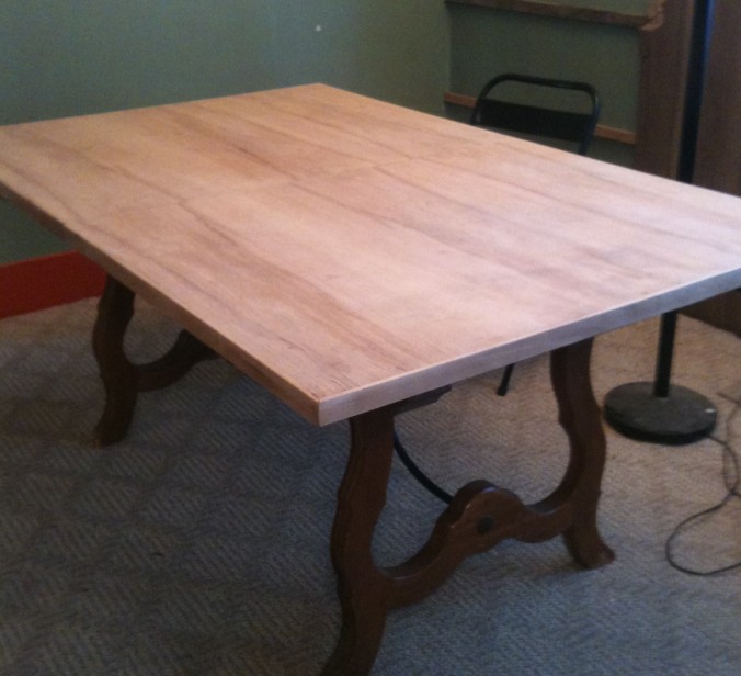
Truth be told, my mom paid her dues for painting all that wood furniture. (She also painted a carved wooden love seat and several oak pressed-back chairs orange, as well as two beautiful rattan easy chairs chartreuse!) When the trend for country furniture started in the late seventies, she and my dad were early adopters. (The first Country Living magazine was published in 1978 — probably a direct result of all that bad furniture painting and colors of the sixties and early seventies!) They bought beautiful old furniture at auctions and sales, stripped it, and refinished it with natural oil finishes. When she found this primitive hutch in Uncle Judd’s basement, it was painted a lovely shade of pink and was storage for paint supplies — a fitting tribute to what often happens to painted furniture…
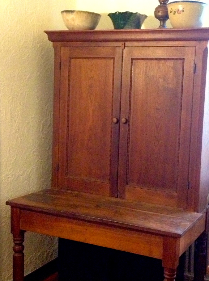
Aunt Sara and Uncle Judd were astonished when my mom picked that particular pink piece of furniture. Mom dragged it home (it comes apart in two pieces) and she and Dad lovingly restored it. Mr. H.C. thinks it is walnut. It is a bit quirky, but I love the fact that it is a one-of-a-kind antique, passed down through family, that many hands have touched it, restored it, made it their own. I love the circle that life is.
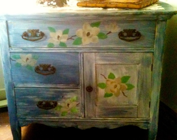
I understand wanting to make a piece of furniture, or a house, your own — individualizing it. That’s what we are doing with Apple Hill Cottage, after all. DIY is good. But what happens when the DIY goes bad? Let’s face it, that little washstand I painted and stenciled? I didn’t do such a good job of it. AND fashions change. The turquoise of today will be tomorrow’s outdated color. The white cabinets of today will be dated in ten years.
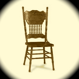
This is the classic pressed-back chair, and very similar to the one I painted glossy forest green…
Recently I read a post about “reviving an antique Windsor chair” by painting it blue. I laughed to myself. I did that once. I painted a lovely oak pressed-back chair glossy forest green; BUT I only painted it because it had already been painted orange. (Yes, by my mom — it sat right next to that orange washstand in our basement.) And it was never going back to its beautiful oak original beginnings.
All those rungs? All that carving? All that glossy paint? I repeat: Don’t paint it, if it can never be reclaimed.
…Which translates into the following rules suggestions for painting wood:
- Do not paint any family heirlooms.
- Do not paint anything that might be valuable the way it is.
- Do not paint anything that has carving or curves or moulding that would be hard to sand back to its original condition.
- Do not spend any more than $35 on any piece of furniture you are planning to paint. (Well, maybe $50 if you live in a city…)
- Try to find pine furniture (or poplar) for painting. Or better yet, find something that has already been painted.
- Paint only furniture that you are willing to refinish or throw away, when your mind (or the fashion) changes.
And our minds change frequently, don’t they?
With all that said, I’m looking for a few cheap dining room chairs to paint….

This lovely painted pressed back chair is from the Irish Lady’s Blog. If you live in Texas, you could drop by her shop and purchase this pretty chair. It looks lots better than the one I painted glossy green (but that’s because glossy forest green is currently out of fashion…)
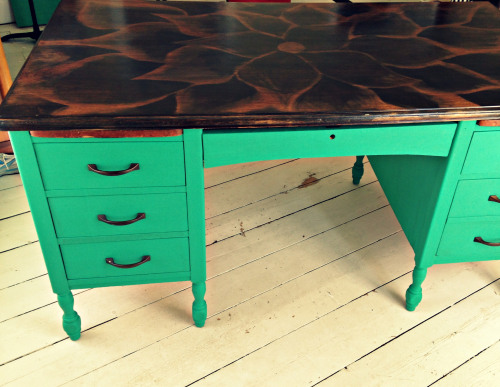
Emerald green, however, was Pantone‘s color of the year this year. And Tricia at the Domestic Fringe just posted this DIY painted desk. She found the desk set out for the garbage — in which case, it is totally OK to paint. Especially when you can do this to the top:
I have an ugly wood desk in my not-open-to-the-public craft room upstairs. I would love to have that flower top on it… And I could paint the bottom a pretty, rust-colored orange… oh, wait. I can’t paint it orange! It belongs to Mr. H.C., the carpenter who hates to paint wood. But I do have a washstand that could stand to be painted…Maybe orange, huh, Mom?


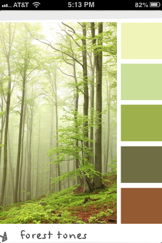
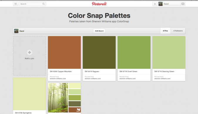
 Once you select “use” the fun starts. Just tap the color you want to find first, and that color shows up in a little square. If it isn’t quite the shade you want, move your finger around until you find the shade you like. Then lift your finger, and the color (and its name) appears at the bottom of the screen.
 You can save up to eight colors on the screen in a palette. You can also adjust the colors, if you would like to have one color just a little bit lighter, or another color just a bit more intense. Once you have all the colors you like in the palette, save it under a name by tapping on the curved arrow at the top right of the screen. I would save this palette under sunrise, but you can be as creative as you want!