141. A Rant: How Can Color Go Out-of-Style?

Editor’s Note: The writer has never in her adult life claimed to be in style or cared about being in style. Yet, like everyone who has eyes and ears, the writer is affected by what she sees, so in that case, we are all affected by what is in style, whether we want to be (or care) or not. 

This post has been swirling around in my head and on my computer for months. It’s been edited and re-edited. Mostly it just irritates me that there are Colors of the Year. Indeed, how can a color go in and out of style?

ColorWheelJewel tones? lush emerald, dark ruby red, and midnight blue. Beautiful always, yes?

Nature tones? pine green, autumn rust, walnut brown? Beautiful always, yes?

Brights? sunny yellow, lime green, sky blue? Beautiful always, yes?

Designers and style companies tell us that the number one way to sell your house faster is to get rid of those “out-of-style” paint colors and “do fresh.” Shabbiness and fading aside, I’d just like to point out that the colors we’re being told to paint over now, are the colors we were told to paint then.

Earlier this year (when we still had a house on the real estate market) Zillow sent me an article called Top 5 Home Design Trends of 2015. I don’t know why I read it; curiosity, I guess. But it just irritated me greatly. (Judging from the comments, this was true for many people…) So in case, you care about such things, midnight blue is in, coral and other Bright Colors are out — according to this particular designer. I’m not sure how she could proclaim that coral is out, but she did. Perhaps it is now called Melon?

A few years ago I remember reading that the new bright colors reflected the happy, positive mood of consumers. I guess we’re not happy any longer… (I’m very glad that Midnight Blue is back in, though. I painted a dining room wall that color in 1982; I loved it then, and I still love that color now.)

About fifteen years ago my daughter wanted a mint green formal for the senior prom. We went to every JoAnn Fabric store in Western PA (and there are a lot!) until finally some nice clerk at the fabric counter took pity on me. No, she told us. You can’t get that color this year. It just isn’t being made. You can get this pretty celery green, instead?

This is just one of the RGB charts available from My Practical Skills, a design student's dream site.

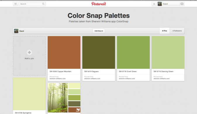
This is just one of the RGB color charts available from My Practical Skills, a design student’s dream site. Can you pick the shades that are in style?

Yes, we can’t have everything all the time, but for ten years I looked for deep forest green accessories to go with a rug — pillows, curtains, fabric, bedspread — anything!

Nothing — that’s what I found. So if a color is not “in” just wait ten years until your rug wears out…

Yes, there are way more important issues in the world, but isn’t this symptomatic of our Western culture of materialism? Planned obsolescence — if the color is out-of-style then we’re likely to replace it, aren’t we? That deep, dark green that is the color of pine trees? Out? Outre? Not available? Because a bunch of industry leaders in a board room got together and decreed it, so they can sell more stuff in a different “updated” shade of green?

In my humble opinion :-) color should not be associated with in style or out-of-style. If you want to call my shirt or my couch or my lamp out of fashion, fine. But leave color out of it.

I found the tablecloth below– unopened in its original package — in an antique store last fall. I loved the colors, and they go in my dining room perfectly. I know that the tablecloth is probably out, but I. Don’t. Care. It’s perfect, and I smile every time I put it on the table. Isn’t that what color is about?

And the color on my dining room wall?

Yep, I still love that deep forest green of pine trees. Only now it’s back in. Just don’t call it Forest Green.

77. Living Color

Here at Apple Hill we are obsessing over color. Again. It seems to happen every time I think about painting a room.

I have just found the best tool AND I’m going to share with YOU. Now, I admit to not being the first one on the block to hear about and adopt the new. I’ve never been (and never will be) trendy. BUT this is one cool tool. And if you already knew about it, WHY DIDN’T YOU TELL ME?

Even Mr. H.C. was excited about it! His eyes lit up when I described it to him; he made me download the app on his newer, nicer IPhone (but we won’t go there…) and immediately started messing around with it. Yes, I was miles ahead of him. I had already played with it for an hour before he got home.

Okay, so everyone knows that Benjamin Moore has all the best colors. The decorators all use their paint; the fancy home decorating mags all use their colors; I, myself, love their colors. BUT this tool is from Sherwin Williams and it has any Benjamin Moore color tool beat all to pieces! Ahem…

It is called Color Snap. Go to your favorite app store and download it immediately. It’s Free. How could a color junkie have so much free fun in the privacy of her own home?

Color Snap

As you can see from the logo page, Color Snap lets you use a photo that is already in your photo library, or you can snap a new one that inspires you. Once the photo is loaded into Color Snap, you can move the cursor around to find the color you like, and Color Snap matches it with a Sherwin Williams paint color. This is like your own Design Seeds (without all the hard work!)

This app is super easy, but I’ll walk you through it because it is so much fun! We are going to find the paint colors in this beautiful photo I took of a sunrise at Apple Hill.Sunrise

Here is what it looks like on the Color Snap App: (Hold your tongue and say it three times fast…)
Color Snap 
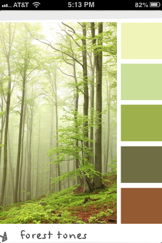
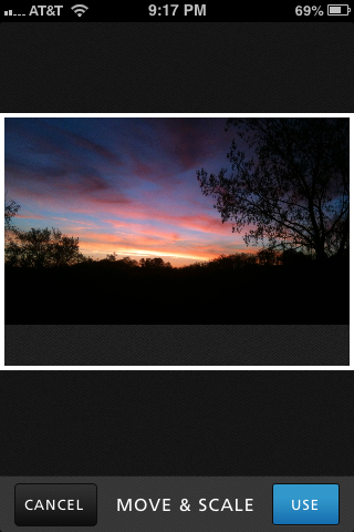
Once you select “use” the fun starts. Just tap the color you want to find first, and that color shows up in a little square. If it isn’t quite the shade you want, move your finger around until you find the shade you like. Then lift your finger, and the color (and its name) appears at the bottom of the screen.Color Snap
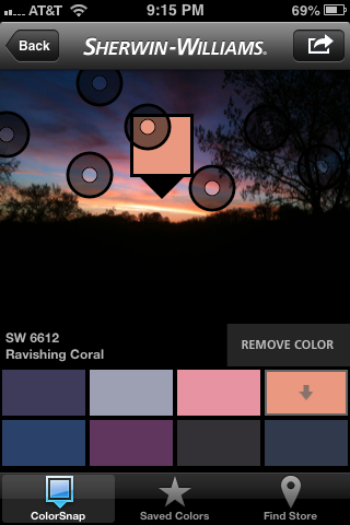
You can save up to eight colors on the screen in a palette. You can also adjust the colors, if you would like to have one color just a little bit lighter, or another color just a bit more intense. Once you have all the colors you like in the palette, save it under a name by tapping on the curved arrow at the top right of the screen. I would save this palette under sunrise, but you can be as creative as you want!

I have been going back and forth on the Benjamin Moore web site for days trying to find the right paints that match my Forest Tones palette from Design Seeds.Design Seeds Forest Tones
I’ve been trying to pin the paint colors to my Pinterest board, but some of the colors just won’t pin, and I can’t get them side by side to look at them, and it has just been very frustrating. In about thirty minutes, I had the colors from Sherwin Williams saved on my phone — and that includes downloading the app and learning how to use it.

And the colors are: Springtime, Dancing Green, Overt Green, Saguaro, and Copper Mountain. I know you can’t tell colors from a computer monitor, but check out this screen shot of my pinterest board.

Pinterest screen shot

This compares the paint color with the Design Seeds palette Forest Tones. If you check out these colors on the Sherwin Williams website, it also gives the RGB value for all the colors…

The only drawback I could find to this clever little app was that sometimes my fingers travel to a wrong spot, and I lose the photo and the colors before I’ve saved it. That’s happened twice now; it is mildly frustrating. So just save the colors once you have the names! Now, get out there and capture some color!

Just so you know, Sherwin-Williams paid me nothing for this rave review. They don’t even know I exist. They should at least give me a free gallon of paint, don’t you think?

16. The Color of Apples

More thoughts on color…I’ll try to keep to the topic this time.

I’m having trouble making decisions about paint color in the kitchen. It is — or will be — black and white mostly (floors, cabinets, counter tops, walls) with rich chestnut-colored wood antique pieces (island, cupboard, butcher block tops). It needs an accent color. I thought I had decided on a delicious apple-cranberry red. Sister Diane (rehabitatdesign.com) sent me 10 sample shades of cranberry-ish reds from Benjamin Moore. Every time I looked at them, I chose a new color as the one I liked best. Asking Mr. H.C. for his favorite just confused matters even further. Being a word person, the names of the colors matter to me–several times my favorite turned out to be Confederate Red, but how could I pick that color for a Pennsylvania cottage kitchen? Why couldn’t my favorite be Hot Apple Spice? (Pomegranate wasn’t bad and that’s acceptable…I DO realize this is extremely silly.) I finally put them away in the envelope to look at again later.

This kitchen (with our floor) doesn’t seem to have any other colors except the general colors of the accessories–pottery, dishes, glassware, etc. I guess that’s always an option. (Just look at what light does to the colors in this photo!)

While the samples were languishing away in the envelope, I received my free issue of Better Homes and Gardens. I signed up for a free year at the Home Show in February and had it sent to the Apple Hill address. It’s the only mail we get there, and it’s always a nice surprise. In this issue is a lovely black and white kitchen with apple green accents. (Are you noticing a theme here? It is called Apple Hill Cottage after all!) The original rooms in the cottage were all painted in different shades of green. Not anything particularly inspiring, but green nevertheless. After considering it a bit, I’ve realized that green has always been my favorite color. Even as a young kid when people would ask my favorite color, I would say green. There isn’t a hue or shade of green that I don’t like (unless it’s some shade of yellow that is being falsely called green). In my current house, three rooms are green and the living room is autumn colors with a moss green rug and chair. So after checking out the onscreen colors at Benjamin Moore, I’ve decided I like Lime Twist, Paradise Hills Green, Fresh Grass, and Apple Lime Cocktail. (Napa Vineyards is nice too.) Notice that these colors all have perfectly lovely names–Paradise Hills Green, ahhh…

The floor is wood, but these might be the general colors…

I was looking at the Armstrong tile page and I came across a “picture this floor” demo. Choose the room you’re doing, the style of your room, the floor you like, the cabinet color (very limited choices here), a paint color and…Voila:

I got to compare the green colors listed above; this one pictured is Lime Twist. It’s a very fun tool. You can find it here: Armstrong Room Planner.

This is just for the general idea–I really disliked all the reds I tried.

So now I’m back to confusion again. Blue is definitely out, because Mr. H.C. hates blue. Who knew? How could he have such aversion to the color of sky? I recently read a blurb on color that suggested people score better while taking tests in rooms that are painted blue. The same article suggested painting your ceilings blue, the sky color, for calming effects. Noooo, don’t want a blue ceiling. I do love this kitchen though:

The screen door to the pantry is so interesting, and I was planning on putting one just like it in our kitchen going into the pantry/laundry room/basement, but Michael says no go. Bad air flow for a screen or something like that…

Another color consideration is this– There is not a lot of natural light in our kitchen, and I think this is a point for the light, spring green. A double window is over the sink and the only other light comes from the narrow french doors we found for the entry.

$35 each–$70 total. SOLD!

It was so exciting to find these. We’d had a long dry spell at our favorite Junque store haunts and were thinking we’d just have to go with Big Box new. After pricing one up ($750 at HD!) we stopped at the ReStore in Washington. Two miles and ten minutes later we found these beauties.

The message here is: Patience. (I think I’ve heard that before!) Don’t be in a hurry.

So what I really think is this: If you surround yourself with what you like and don’t worry about style, or trends, or matching colors, it will all turn out lovely in the end. I’m hoping!