I THINK
I will write you a letter,
June day.
Dear June Fifth,
you're all in green,
so many kinds and all one
green, tree shadows on
grass blades and grass
blade shadows. The air
fills up with motor
mower sound. The cat
walks up the drive
a dead baby rabbit
in her maw. The sun
is hot, the breeze
is cool. And suddenly
in all the green
the lilacs bloom,
massive and exquisite
in color and shape
and scent. The roses
are more full of
buds than ever. No
flowers. But soon.
June day, you have
your own perfection:
so green to say
goodbye to. Green,
stick around
a while.
         -- James Schuyler
James Schuyler has written the perfect poem: a love letter to a day in June. Not just any day. Today.
June green is unlike any other, vibrant and alive, still nourished by the spring rains, not yet ruined by hot sun, nor eaten by insects. Next to the June green, the peonies are more vibrant, the sundrops more sunny, the daisies more pure. Yes, June green is more.
The gardens are planted, red pears and green apples are growing, cherries are ripening, birds are nesting, perching, and singing.
The wild primrose opened in Sunday’s sun and surprised the surrounding motley plants. Her dazzling yellow perks up the shabby shed and makes the neighboring weeds look more stately.
The new gate opens wide and the new fence keeps the fruit trees in and the riffraff critters out (so far).
If I stand by the garden gate I can watch the grape vines growing, their tendrils curling around and around. The grapes are too small still to be more than a vague hope. Will they be sweet? Will they be juicy? Will they be jam or wine?
The cherries are yellow, blushing pink. I ate one today, still sour, still small. Bluebirds are nesting in the eaves of the porch; wrens are nesting by the door. They can have some cherries as long as they share the deep blue June sky.
Dear June fifth, you are glorious. You are enough.
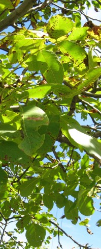
Spring brings such a great variety of green colors that all seem to go together so perfectly.
Outside.
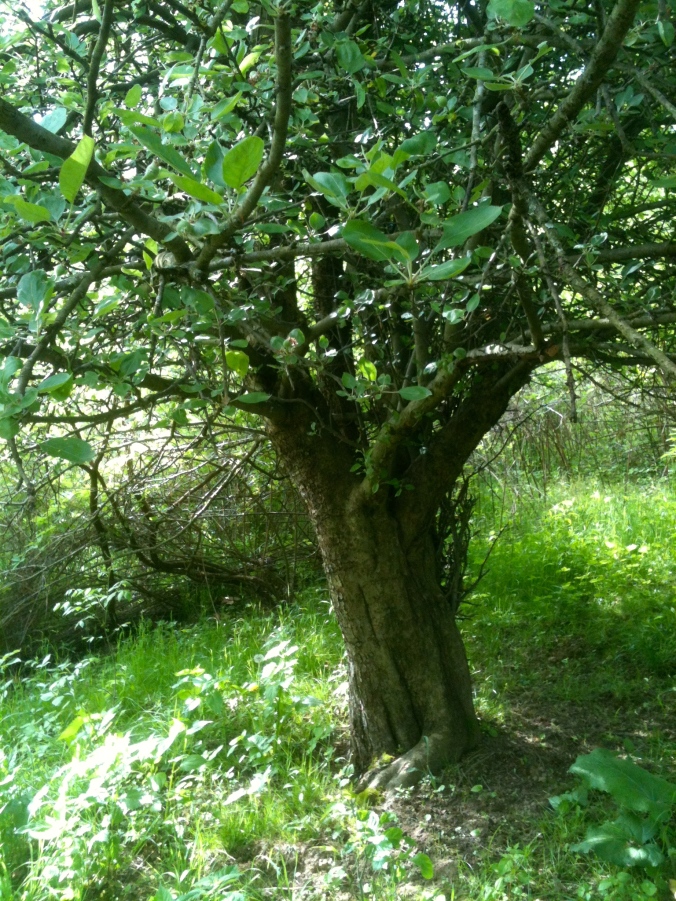
The greens of nature under an apple tree.
Inside, it’s another story — greens don’t always meld together indoors as they do in nature. In the natural world, colors just seem to harmonize; the best color matching is always a close copy of God’s own perfect design.
I learned a new word the other day. Metamerism
Metamerism. (met-TAM-er-ism) It is the effect that light has on color, specifically the type of lighting used to illuminate color and how it affects our perceptions of shades and matching.
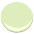
Benjamin Moore Blooming Grove
When I think of color and light I tend to get off topic (see post 15. The Color of Light) because the physics and metaphysics of light, color, and sight is amazing to me. How do I know if the beautiful shade of Blooming Grove green in my kitchen is the same color you see?
I don’t. It all comes down to our eyes and the light.
The varieties of light make colors change. Fluorescent lights, incandescent lights, LEDS, those squiggly bulbs…they all make the same color look different. That’s why decorators tell you to paint a giant swatch in your room. The same color that you love in your north-facing kitchen will look different in the south-facing bedroom. That same color will even change in morning light to afternoon light. Think of the sunlight on the trees and how it changes their colors.
And for another example, look at this photo of the kitchen in the late afternoon sun.
Whose kitchen is this anyway?
The green on the door and the green on the wall are the same, but look how the light has changed the colors. The wall looks yellowish-green because of the sun streaming in the window. And not only the greens, look at the different shades of white on the walls and ceiling that the shadows and sunlight produced. The walls, ceilings, and cabinets are all Sherwin Williams Steamed Milk, though they are different sheens. The sheen of paint –semi-gloss, matte, satin — also affects the color we see because different sheens reflect the light differently. I think (no scientific proof behind this at all) that our eyes adjust to some of this. We see the different shades, yet our brain knows they are the same color.
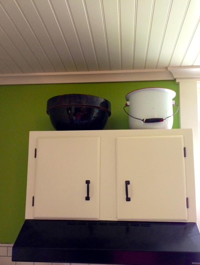
The ceiling and the cabinets and the crown moulding are all painted with Sherwin Williams Steamed Milk.
I’m thinking about colors again because as we are winding down the kitchen project, we find ourselves looking around, wondering what the NEXT BIG PROJECT will be. Granddaughter Olivia voted for the Dining Room/Living Room combo because, as she says, “You walk right from the kitchen into THIS.”
Under construction… and yes, that is a clothes dryer right next to the stove! It’s good for hiding dirty dishes.
See the green wall on the left in the above photo? That is the dining room wall. The Dining Room/Living Room is an upside down L-shape and open to the kitchen. So it matters that the colors in the Dining/Living area co-ordinate with the bold green of the kitchen. I vaguely thought of this once, but now I’m thinking of it more… I don’t want Blooming Grove Green anywhere else in the house, except possibly as an accent in the mudroom. I’ve looked at the next colors down on the color chart from Blooming Grove; Apple Froth is a possibility, but it might be a little, well, frothy…(I do like the name, though.)
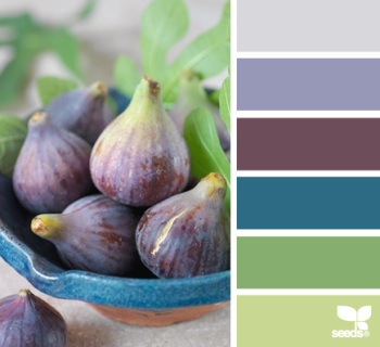
There is a great website for those who love color called Design Seeds. If you’ve never heard of it, definitely click on that link above. I am totally jealous of this idea — I wish I’d thought of it! Here is an example:
This is called Fig Hues from Design-Seeds. I love these colors, but Mr. H.C. doesn’t like blue…
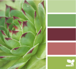
She takes colorful photographs–from nature, architecture, food, animals — and separates the colors for a palette. Here are four palettes that I particularly like for the living/dining area.
Tropical Greens. All these greens melding in nature — this is what I had in mind. I think the one shade of olive brown would have to be cinnamon though (for our leather couch…)
Planted Hues. Not sure about the light rose color here; it might work with our furniture. We have antiques.
Forest Tones. This is my current favorite. I love how all the greens go together, and there is the rust of our couch in there too.
Bamboo Tones. These three greens are quite nice together and the creamy color is very similar to the off-whites we’ve been using.
And so now, readers, we are doing some audience participation once again. Which of the above palettes is your favorite? Make your choice of the above palette by June 2nd, and, using your best words, say why you like it most. The loveliest worded entry will receive a FREE BOOK on decorating. (I get to pick the winner — it’s my blog after all…) The book is a copy of either Perfect English Farmhouse or Perfect English Cottageboth by Ros Byham Shaw, and you can read my post on these books here. (One of the books belongs to my son-in-law, and he gets first dibs.)
Disclaimers:
Please enter only once.This is a “like-new” book. I read it — hey, if you read my last post, you know why I’m having book giveaways…No one is responsible for this give-away but me, and no one is making any money on it, and I bought the book with good hard-earned money, and I’m paying the postage for the winner to receive it. :-)If you live outside the United States, it doesn’t decrease your chance of winning, but it does seem likely that you won’t get your book as quickly. (My son sent me a postcard from New Zealand in December, and I received it just a few weeks ago in April.)Choose your favorite palette below.
June 4, 2013 Oh, it was so hard to pick the winner — you all had such good comments, and lovely phrases. Thank you each one for commenting, and I wish I had a decorating book to send each of you. Full of Grace-DJ is the winner of Ros Byham Shaw’s book.


 The varieties of light make colors change. Fluorescent lights, incandescent lights, LEDS, those squiggly bulbs…they all make the same color look different. That’s why decorators tell you to paint a giant swatch in your room. The same color that you love in your north-facing kitchen will look different in the south-facing bedroom. That same color will even change in morning light to afternoon light. Think of the sunlight on the trees and how it changes their colors.
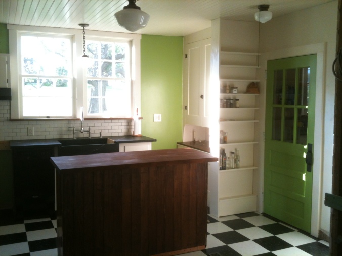

 I’ve looked at the next colors down on the color chart from Blooming Grove; Apple Froth is a possibility, but it might be a little, well, frothy…(I do like the name, though.)