77. Living Color

Here at Apple Hill we are obsessing over color. Again. It seems to happen every time I think about painting a room.

I have just found the best tool AND I’m going to share with YOU. Now, I admit to not being the first one on the block to hear about and adopt the new. I’ve never been (and never will be) trendy. BUT this is one cool tool. And if you already knew about it, WHY DIDN’T YOU TELL ME?

Even Mr. H.C. was excited about it! His eyes lit up when I described it to him; he made me download the app on his newer, nicer IPhone (but we won’t go there…) and immediately started messing around with it. Yes, I was miles ahead of him. I had already played with it for an hour before he got home.

Okay, so everyone knows that Benjamin Moore has all the best colors. The decorators all use their paint; the fancy home decorating mags all use their colors; I, myself, love their colors. BUT this tool is from Sherwin Williams and it has any Benjamin Moore color tool beat all to pieces! Ahem…

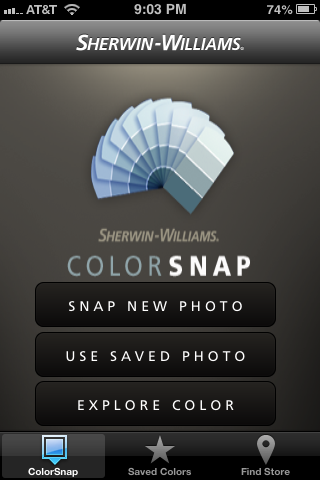
It is called Color Snap. Go to your favorite app store and download it immediately. It’s Free. How could a color junkie have so much free fun in the privacy of her own home?

Color Snap

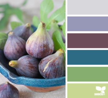
As you can see from the logo page, Color Snap lets you use a photo that is already in your photo library, or you can snap a new one that inspires you. Once the photo is loaded into Color Snap, you can move the cursor around to find the color you like, and Color Snap matches it with a Sherwin Williams paint color. This is like your own Design Seeds (without all the hard work!)

This app is super easy, but I’ll walk you through it because it is so much fun! We are going to find the paint colors in this beautiful photo I took of a sunrise at Apple Hill.Sunrise

Here is what it looks like on the Color Snap App: (Hold your tongue and say it three times fast…)
Color Snap Once you select “use” the fun starts. Just tap the color you want to find first, and that color shows up in a little square. If it isn’t quite the shade you want, move your finger around until you find the shade you like. Then lift your finger, and the color (and its name) appears at the bottom of the screen.Color Snap
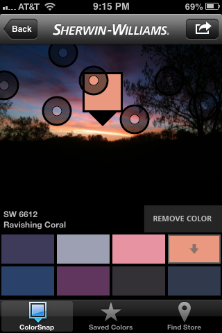
You can save up to eight colors on the screen in a palette. You can also adjust the colors, if you would like to have one color just a little bit lighter, or another color just a bit more intense. Once you have all the colors you like in the palette, save it under a name by tapping on the curved arrow at the top right of the screen. I would save this palette under sunrise, but you can be as creative as you want!

I have been going back and forth on the Benjamin Moore web site for days trying to find the right paints that match my Forest Tones palette from Design Seeds.Design Seeds Forest Tones
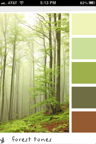
I’ve been trying to pin the paint colors to my Pinterest board, but some of the colors just won’t pin, and I can’t get them side by side to look at them, and it has just been very frustrating. In about thirty minutes, I had the colors from Sherwin Williams saved on my phone — and that includes downloading the app and learning how to use it.

And the colors are: Springtime, Dancing Green, Overt Green, Saguaro, and Copper Mountain. I know you can’t tell colors from a computer monitor, but check out this screen shot of my pinterest board.

Pinterest screen shot

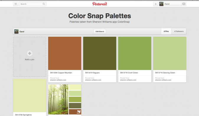
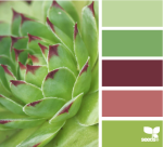
This compares the paint color with the Design Seeds palette Forest Tones. If you check out these colors on the Sherwin Williams website, it also gives the RGB value for all the colors…

The only drawback I could find to this clever little app was that sometimes my fingers travel to a wrong spot, and I lose the photo and the colors before I’ve saved it. That’s happened twice now; it is mildly frustrating. So just save the colors once you have the names! Now, get out there and capture some color!

Just so you know, Sherwin-Williams paid me nothing for this rave review. They don’t even know I exist. They should at least give me a free gallon of paint, don’t you think?

76. ReHabitat-ing the Yellow Bedroom, Part 3

The yellow bedroom is yellow no more. Even the closet has not a vestige of yellow left! We are mulling over a new name — just “the bedroom” doesn’t adequately cover its transformation. The change has been slow. I’ve been working on it by myself when unskilled labor is not needed in the kitchen. Taping and priming and painting the woodwork,IMG_1955IMG_1993 patching the walls, taking off doors, priming and painting the closet, sanding and painting doors… It all sounds impressive, but it wasn’t. It was tedious, hard-on-the-poor-old-knees-and-back work. Mr. H.C. stopped work in the kitchen long enough to help me do the actual painting of the ceiling and the walls. There are still some minor embellishments to be added — I’m working on the bedskirt, the bed will be getting some fancier pillows, and there are still pictures to hang on the walls — but it sure looks amazing to us! Come in for a peek —

IMG_1153

What I really like about this room is that mostly we’ve used antiques and family collectibles that we already owned. The dresser, the metal shelf and the quilt belonged to Clara, Mr. H.C’s mom who slept in this bedroom long before we did; the nightstand belonged to Mr. H.C. when he was a little boy and still known as Mikey; the cedar chest was made by Pa — my grandfather who first built the cottage; Dad made the little wooden lamp, and the mirror and the bookstand under it came from him as well; my mom painted the birds. And Diane and Emily, my sister and niece gave us the footprint for the colors, the design, and ideas on how to use the furniture.

New closet doors

That’s Clara’s appliqued quilt on the cedar chest. She told us it was probably the most valuable thing she owned. We’ve found the date on it, but it is embroidered in white on white and it’s hard to read — 1882 or 1932 — we just aren’t sure.  Clara gave me a whole bag of vintage linens before she died, because she knew I love them;  the two pillowcases on the bed and the lacy cloth hanging on the shelf are part of her collection. Sanding old doors
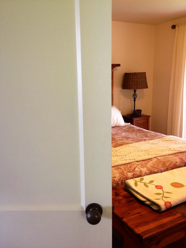
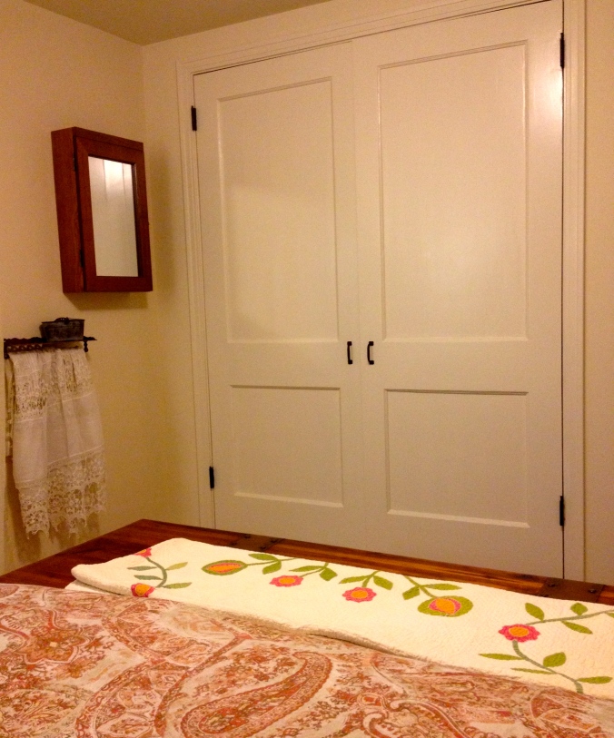
The closet doors were old fashioned paneled doors that Mr. H.C. found at Construction Junction for $30 each; we were delighted to get rid of  the boring sliding doors that didn’t slide. The new/old doors were in my sanding shop for several days (five coats of paint and shellac as the bottom layer!) and then primed. Mr. H.C. hung them, and unlike usual, we painted them after they were hung. The handles were left over from our kitchen cabinets. If you are reading about this bedroom for the first time, its transformation was planned by the online decorating company,  ReHabitat Design and you can read about the stages in posts 37 and 43.
Bedroom Remodel
IMG_2479

Pa — my grandfather who built the cottage originally — made the cedar chest as a Christmas present for my grandmother in 1924 — he even put a plaque on it. Before we brought the chest down from our city house, we were skeptical whether it would fit. After we put it at the foot of the bed, Mr. H.C. said, “This actually makes the room seem bigger, dont’cha think?” Yes, I do.

The headboard is made from an old door that Mr. H.C. scored (also from Construction Junction) for fifteen dollars. He cut it off at five feet to fit our queen-sized bed, and I sanded it. The inspiration for this is from the website Hometalk: I really liked the look of the door on this website, but doors have different personalities after sanding, and I had to respect what it was. I fooled around with paint and glaze and came up with this. It isn’t exactly what I had envisioned, but I was trying to be open about this project, and we both like how it came out. IMG_2476

The oak shelf on the top was taken right off the wall in the living room where it once was Clara and Joe’s mantle. It fit perfectly on the headboard; I think they would be pleased. And my mom painted the birds that sit on the shelf. They used to be in the bathroom in the house where I grew up; I love them on this headboard shelf.

Closet doors are painted Sherwin Williams Steamed Milk, semi-gloss.

This mirror and little bookshelf/table under it came from my dad; he also made the small wooden lamp on the dresser.

Sister Diane made the hand-crocheted afghan that’s on the bed for my mom many years ago. I bet she wants it back now. :-) And the pretty little carved basket on the headboard shelf was a Christmas present from sister-in-law, Rita.
headboard made from old door

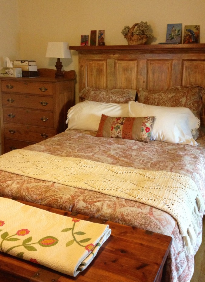
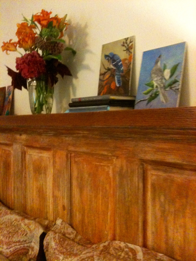
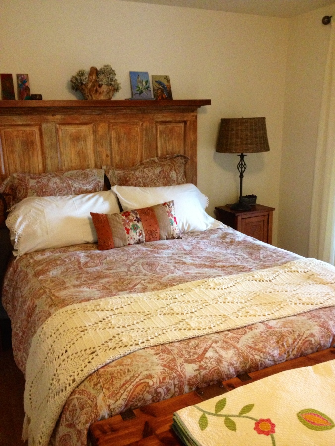
These new finials dress up Clara’s old curtain rod, which I spray painted eons ago. The finials were new from Bed Bath and Beyond and they didn’t fit the old rod. But Mr. H.C. cut a piece of wood to fit in the rod and added a couple of screws — Voila! I think he can fix anything… And just in case you forgot what the room used to look like…

yellow bedroom
Factoids: The wicker lampshade, the duvet cover and shams, and the curtains are from Pottery Barn. The two other lampshades are from Target. The curtain rod finials are from Bed, Bath, and Beyond, but don’t count on them fitting any other curtain rod except the ones that are sold with them! The rug on the floor was from Rug Depot a few years ago, but it is still a great place to buy rugs and runners. And the little art on the left of the headboard is from a great little Etsy shop, McWissenville. The walls and ceiling are painted with Benjamin Moore Winter Wheat (232) matte; the trim and closet doors are painted the same shade we used in the kitchen — Sherwin Williams Steamed Milk  (7554) semi-gloss. The paint and glaze for the headboard came from Sherwin Williams as well; the color is Brandywine.

66. Sunlight, Shadows, and Metamerism

Spring brings such a great variety of green colors that all seem to go together so perfectly.

Outside.

The greens of nature under an apple tree.

The greens of nature under an apple tree.

Inside, it’s another story — greens don’t always meld together indoors as they do in nature. In the natural world, colors just seem to harmonize; the best color matching is always a close copy of God’s own perfect design.

I learned a new word the other day. Metamerism

Metamerism. (met-TAM-er-ism) It is the effect that light has on color, specifically the type of lighting used to illuminate color and how it affects our perceptions of shades and matching.
Benjamin Moore Blooming Grove green

Benjamin Moore Blooming Grove

When I think of color and light I tend to get off topic (see post 15. The Color of Light) because the physics and metaphysics of light, color, and sight is amazing to me. How do I know if the beautiful shade of Blooming Grove green in my kitchen is the same color you see?

I don’t. It all comes down to our eyes and the light.

Sunlight on leavesThe varieties of light make colors change. Fluorescent lights, incandescent lights, LEDS, those squiggly bulbs…they all make the same color look different. That’s why decorators tell you to paint a giant swatch in your room. The same color that you love in your north-facing kitchen will look different in the south-facing bedroom. That same color will even change in morning light to afternoon light. Think of the sunlight on the trees and how it changes their colors.

And for another example, look at this photo of the kitchen in the late afternoon sun.

Whose kitchen is this anyway?

Whose kitchen is this anyway?

The green on the door and the green on the wall are the same, but look how the light has changed the colors. The wall looks yellowish-green because of the sun streaming in the window. And not only the greens, look at the different shades of white on the walls and ceiling that the shadows and sunlight produced. The walls, ceilings, and cabinets are all Sherwin Williams Steamed Milk, though they are different sheens. The sheen of paint –semi-gloss, matte, satin — also affects the color we see because different sheens reflect the light differently. I think (no scientific proof behind this at all) that our eyes adjust to some of this. We see the different shades, yet our brain knows they are the same color.

ceiling is painted Sherwin Williams Steamed Milk.

The ceiling and the cabinets and the crown moulding are all painted with Sherwin Williams Steamed Milk.

I’m thinking about colors again because as we are winding down the kitchen project, we find ourselves looking around, wondering what the NEXT BIG PROJECT will be. Granddaughter Olivia voted for the Dining Room/Living Room combo because, as she says, “You walk right from the kitchen into THIS.”

Under construction

Under construction… and yes, that is a clothes dryer right next to the stove! It’s good for hiding dirty dishes.

See the green wall on the left in the above photo? That is the dining room wall. The Dining Room/Living Room is an upside down L-shape and open to the kitchen. So it matters that the colors in the Dining/Living area co-ordinate with the bold green of the kitchen. I vaguely thought of this once, but now I’m thinking of it more… I don’t want Blooming Grove Green anywhere else in the house, except possibly as an accent in the mudroom. Apple Froth 409
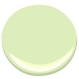
I’ve looked at the next colors down on the color chart from Blooming Grove; Apple Froth is a possibility, but it might be a little, well, frothy…(I do like the name, though.)

There is a great website for those who love color called Design Seeds. If you’ve never heard of it, definitely click on that link above. I am totally jealous of this idea — I wish I’d thought of it! Here is an example:

This is called Fig Hues from Design-Seeds. I love these colors, but Mr. H.C. doesn't like blue...

This is called Fig Hues from Design-Seeds. I love these colors, but Mr. H.C. doesn’t like blue…

She takes colorful photographs–from nature, architecture, food, animals — and separates the colors for a palette. Here are four palettes that I particularly like for the living/dining area.

TropicalGreens

Tropical Greens. All these greens melding in nature — this is what I had in mind. I think the one shade of olive brown would have to be cinnamon though (for our leather couch…)

Not sure about the light rose color here; it might work with our furniture. We have antiques.

Planted Hues. Not sure about the light rose color here; it might work with our furniture. We have antiques.

ForestTones -- Design Seeds

Forest Tones. This is my current favorite. I love how all the greens go together, and there is the rust of our couch in there too.

Bamboo Tones -- Design Seeds

Bamboo Tones. These three greens are quite nice together and the creamy color is very similar to the off-whites we’ve been using.

And so now, readers, we are doing some audience participation once again. Which of the above palettes is your favorite? Make your choice of the above palette by June 2nd, and, using your best words, say why you like it most. The loveliest worded entry will receive a FREE BOOK on decorating. (I get to pick the winner — it’s my blog after all…) The book is a copy of either Perfect English Farmhouse or Perfect English Cottage both by Ros Byham Shaw, and you can read my post on these books here. (One of the books belongs to my son-in-law, and he gets first dibs.)

Disclaimers:

    Please enter only once.
    This is a “like-new” book. I read it — hey, if you read my last post, you know why I’m having book giveaways…
    No one is responsible for this give-away but me, and no one is making any money on it, and I bought the book with good hard-earned money, and I’m paying the postage for the winner to receive it. :-)
    If you live outside the United States, it doesn’t decrease your chance of winning, but it does seem likely that you won’t get your book as quickly. (My son sent me a postcard from New Zealand in December, and I received it just a few weeks ago in April.)
    Choose your favorite palette below.

June 4, 2013 Oh, it was so hard to pick the winner — you all had such good comments, and lovely phrases. Thank you each one for commenting, and I wish I had a decorating book to send each of you. Full of Grace-DJ is the winner of Ros Byham Shaw’s book.