30. A Stillness in Time

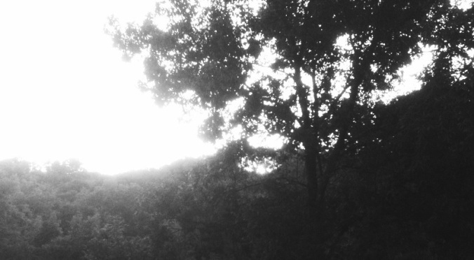
I’ve been experimenting with black and white photography these past two weeks. Perhaps it is a bit ironic that as autumn’s colors are at its most glorious, I’m choosing black and white. It could be that my camera can’t capture the beauty of fall; but I think it is more of a mood. I hear friends say how much they love fall and its coolness, but I miss the sun and the warm. The last gasp beauty of the bright, God-painted trees can’t make up for the gray, cold rain.

Is it just the absence of color that creates the different moods of black/white/gray photos? Is it the lack of color that makes the observer focus on form, line, and shape? What gives the dreamlike, still, unearthly qualities to black and white photography?
20121016-084816.jpg

As I was reading about the feelings that black & white photos evoke, one phrase keeps rumbling in my mind — that it creates a sense of stillness in time. Being here at the cottage does that for me as well, so the two have merged in this post. It is a stillness, a peace, a quietude that is not in my “other” life. It is almost as if time is standing still when we are here.

There is something else that a black and white photo implies — simplicity. I’m not sure why… Is it because it reminds us of a simpler time? Or is it that the colors don’t get in the way of what we see? Details and shadows all become clear, yet at the same time, shrouded in mystery…a metaphor for life, for God.

20121016-161026.jpg

Life is simplified here at the cottage: work and jobs are left behind; meetings and responsibilities are rare; we don’t have much technology, just our cell phones and a television to watch Steeler games. We are focused on here, today, now, and what we have to accomplish — our purpose, for now. To everything there is a season, and a time for every purpose under heaven.–Ecclesiastes 3:1.

20121016-162922.jpg

In Mere Christianity C.S. Lewis writes,

The moment you wake up each morning, all your wishes and hopes for the day rush at you like wild animals. And the first job each morning consists in shoving it all back; in listening to that other voice, taking that other point of view, letting that other, larger, stronger, quieter life come flowing in.

Simplicity,
Stillness of time,
Season of quiet,
Circle of life,
Listening to that other voice —
Black and white photos fit Apple Hill Cottage well.

(Don’t worry, I’ll be back to colors next week.)

17. Meanderings at Apple Hill

The birds have flown, the kitty is skittish, and the lazy days of summer are almost gone. Work on the cottage will continue, I know, but probably not with the same freedom of coming here each weekend, working, dreaming, and sitting on the porch.

20120806-075740.jpgOne of our favorite things to do in the mornings and evenings is to sit on the porch watching and listening to the birds. Our identification skills have improved greatly, thanks to my well-thumbed bird book, Birds of North America . We have seen bluebirds, orioles, finches, wrens, woodpeckers, thrushes — we have watched a mockingbird do a song and dance routine on the nearest telephone pole — we watched baby robins get pushed out of their nest one morning and soon they were hopping around the yard looking for their own worms — and we’ve watched the barn swallows soar and dip, eating insects at dusk. Learning to identify their songs has been such a pleasure. This weekend the bird songs have been replaced by the constant hum of cicadas, and the birds are missing. Not a single robin in the grass; no flash of cardinal red; no wood thrush calling its haunting song from deep in the woods; not even any mournful dove songs. All weekend the only birds we saw were two fat crows walking on the grass, and three unidentifiable birds sitting on the wire. I hope they are all just enjoying a week at the beach…

Friend Beth came to visit on Saturday evening and brought another suggestion for a kitty name — Moe. We’ll have to see if this one sticks… He seems very skittish, especially in the dark. Last night we were looking at the stars, and the shadow of a fox ran across the yard beyond the apple trees. “Look, there’s the fox!” I said excitedly to Michael, and the very same second the kitty took off running for the safety of the porch. There was fear in his eyes. He stays very close to us when we are outside, and he won’t go out on the back porch after dark by himself. He sleeps on the bed all night and snores! All this is most unusual behavior for an independent (ex)tomcat! The wounds on his face have almost healed, but he doesn’t seem to have forgotten. Now we are feeling very responsible for him, and it no longer feels okay to just enjoy him when we’re here. We are thinking he will be our indoor house cat in Pittsburgh this winter…

20120806-005631.jpg

A face only a mother could love…

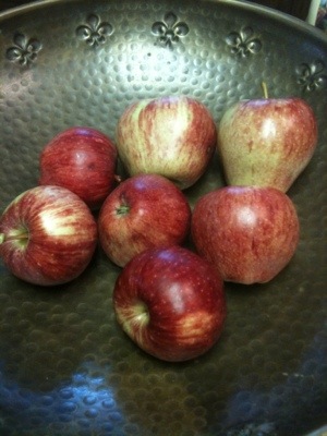
We picked and ate our first apples this weekend:

20120805-234917.jpg

20120805-235013.jpg
The red ones are Red Delicious — which is disappointing as they are no one’s favorite! The green one is as yet unknown; it wasn’t quite ripe and was a bit sour, but definitely edible. We’re thinking a yellow cooking apple — maybe Grimes Golden.

We went out later today and picked a few more.

20120805-235724.jpg

They don’t look or taste too bad for an old, unpruned tree.

We aren’t the only ones who think they aren’t too bad…These are two twin fawns we’ve been watching for a month or so; they’ve only recently started losing their spots. There is a groundhog who comes around also, but he’s too fast for my unskilled photography. As long as they don’t start climbing the trees…

20120805-235910.jpg

Sorry for the blurry shot–I guess National Geographic won’t be calling me for a wildlife photo shoot anytime soon!

We also have about a dozen pears on the young trees we planted this spring. Yes, this is gratification!!!

There were just small projects done this weekend. (It was just too hot for Michael to work in the attic!) I sanded and painted the back porch steps:

20120806-003544.jpg
I kept thinking of my grandfather’s phrase — like trying to make a silk purse out of a sow’s ear. Oh well…the entry to the back porch isn’t high on the priority list; I was just trying to keep the steps from decomposing over the winter. (Notice that I only showed you a picture of the nicely painted steps — the rest of the entry is just too horrible to photograph.)

And we now have numbers on our mailbox post — can’t have the pizza guy passing us by!

20120806-144151.jpg

Michael sanded and hung the door we found at the ReStore for ten dollars. This is the door that goes down four steps into the pantry/laundry room. (Clara’s pantry sign will hang at the top of it–see 10. Clara’s Kitsch.) I primed it, and now it will have to wait for its color until we choose red or green. I’m seeing this door as Red Delicious red. Somehow, I just can’t picture this door in Lime Twist… Anyone have thoughts?

Enjoy the last few weeks of summer everyone. I hope the birds get back safely from their vacations, and everyone gets to enjoy a sunset like this one in these last precious days of August…

16. The Color of Apples

More thoughts on color…I’ll try to keep to the topic this time.

I’m having trouble making decisions about paint color in the kitchen. It is — or will be — black and white mostly (floors, cabinets, counter tops, walls) with rich chestnut-colored wood antique pieces (island, cupboard, butcher block tops). It needs an accent color. I thought I had decided on a delicious apple-cranberry red. Sister Diane (rehabitatdesign.com) sent me 10 sample shades of cranberry-ish reds from Benjamin Moore. Every time I looked at them, I chose a new color as the one I liked best. Asking Mr. H.C. for his favorite just confused matters even further. Being a word person, the names of the colors matter to me–several times my favorite turned out to be Confederate Red, but how could I pick that color for a Pennsylvania cottage kitchen? Why couldn’t my favorite be Hot Apple Spice? (Pomegranate wasn’t bad and that’s acceptable…I DO realize this is extremely silly.) I finally put them away in the envelope to look at again later.

This kitchen (with our floor) doesn’t seem to have any other colors except the general colors of the accessories–pottery, dishes, glassware, etc. I guess that’s always an option. (Just look at what light does to the colors in this photo!)

While the samples were languishing away in the envelope, I received my free issue of Better Homes and Gardens. I signed up for a free year at the Home Show in February and had it sent to the Apple Hill address. It’s the only mail we get there, and it’s always a nice surprise. In this issue is a lovely black and white kitchen with apple green accents. (Are you noticing a theme here? It is called Apple Hill Cottage after all!) The original rooms in the cottage were all painted in different shades of green. Not anything particularly inspiring, but green nevertheless. After considering it a bit, I’ve realized that green has always been my favorite color. Even as a young kid when people would ask my favorite color, I would say green. There isn’t a hue or shade of green that I don’t like (unless it’s some shade of yellow that is being falsely called green). In my current house, three rooms are green and the living room is autumn colors with a moss green rug and chair. So after checking out the onscreen colors at Benjamin Moore, I’ve decided I like Lime Twist, Paradise Hills Green, Fresh Grass, and Apple Lime Cocktail. (Napa Vineyards is nice too.) Notice that these colors all have perfectly lovely names–Paradise Hills Green, ahhh…

The floor is wood, but these might be the general colors…

I was looking at the Armstrong tile page and I came across a “picture this floor” demo. Choose the room you’re doing, the style of your room, the floor you like, the cabinet color (very limited choices here), a paint color and…Voila:

I got to compare the green colors listed above; this one pictured is Lime Twist. It’s a very fun tool. You can find it here: Armstrong Room Planner.

This is just for the general idea–I really disliked all the reds I tried.

So now I’m back to confusion again. Blue is definitely out, because Mr. H.C. hates blue. Who knew? How could he have such aversion to the color of sky? I recently read a blurb on color that suggested people score better while taking tests in rooms that are painted blue. The same article suggested painting your ceilings blue, the sky color, for calming effects. Noooo, don’t want a blue ceiling. I do love this kitchen though:

The screen door to the pantry is so interesting, and I was planning on putting one just like it in our kitchen going into the pantry/laundry room/basement, but Michael says no go. Bad air flow for a screen or something like that…

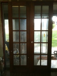
Another color consideration is this– There is not a lot of natural light in our kitchen, and I think this is a point for the light, spring green. A double window is over the sink and the only other light comes from the narrow french doors we found for the entry.

$35 each–$70 total. SOLD!

It was so exciting to find these. We’d had a long dry spell at our favorite Junque store haunts and were thinking we’d just have to go with Big Box new. After pricing one up ($750 at HD!) we stopped at the ReStore in Washington. Two miles and ten minutes later we found these beauties.

The message here is: Patience. (I think I’ve heard that before!) Don’t be in a hurry.

So what I really think is this: If you surround yourself with what you like and don’t worry about style, or trends, or matching colors, it will all turn out lovely in the end. I’m hoping!