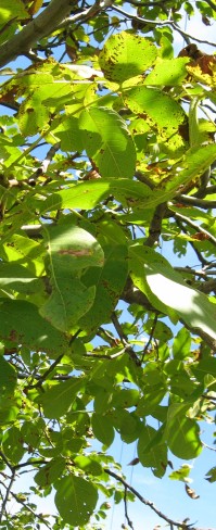
Spring brings such a great variety of green colors that all seem to go together so perfectly.
Outside.
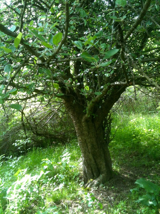
The greens of nature under an apple tree.
Inside, it’s another story — greens don’t always meld together indoors as they do in nature. In the natural world, colors just seem to harmonize; the best color matching is always a close copy of God’s own perfect design.
I learned a new word the other day. Metamerism
| Metamerism. (met-TAM-er-ism) It is the effect that light has on color, specifically the type of lighting used to illuminate color and how it affects our perceptions of shades and matching. |

Benjamin Moore Blooming Grove
When I think of color and light I tend to get off topic (see post 15. The Color of Light) because the physics and metaphysics of light, color, and sight is amazing to me. How do I know if the beautiful shade of Blooming Grove green in my kitchen is the same color you see?
I don’t. It all comes down to our eyes and the light.
 The varieties of light make colors change. Fluorescent lights, incandescent lights, LEDS, those squiggly bulbs…they all make the same color look different. That’s why decorators tell you to paint a giant swatch in your room. The same color that you love in your north-facing kitchen will look different in the south-facing bedroom. That same color will even change in morning light to afternoon light. Think of the sunlight on the trees and how it changes their colors.
And for another example, look at this photo of the kitchen in the late afternoon sun.
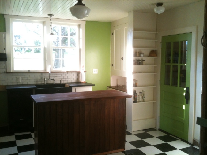
Whose kitchen is this anyway?
The green on the door and the green on the wall are the same, but look how the light has changed the colors. The wall looks yellowish-green because of the sun streaming in the window. And not only the greens, look at the different shades of white on the walls and ceiling that the shadows and sunlight produced. The walls, ceilings, and cabinets are all Sherwin Williams Steamed Milk, though they are different sheens. The sheen of paint –semi-gloss, matte, satin — also affects the color we see because different sheens reflect the light differently. I think (no scientific proof behind this at all) that our eyes adjust to some of this. We see the different shades, yet our brain knows they are the same color.
The ceiling and the cabinets and the crown moulding are all painted with Sherwin Williams Steamed Milk.
I’m thinking about colors again because as we are winding down the kitchen project, we find ourselves looking around, wondering what the NEXT BIG PROJECT will be. Granddaughter Olivia voted for the Dining Room/Living Room combo because, as she says, “You walk right from the kitchen into THIS.”

Under construction… and yes, that is a clothes dryer right next to the stove! It’s good for hiding dirty dishes.
See the green wall on the left in the above photo? That is the dining room wall. The Dining Room/Living Room is an upside down L-shape and open to the kitchen. So it matters that the colors in the Dining/Living area co-ordinate with the bold green of the kitchen. I vaguely thought of this once, but now I’m thinking of it more… I don’t want Blooming Grove Green anywhere else in the house, except possibly as an accent in the mudroom. 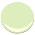 I’ve looked at the next colors down on the color chart from Blooming Grove; Apple Froth is a possibility, but it might be a little, well, frothy…(I do like the name, though.)
There is a great website for those who love color called Design Seeds. If you’ve never heard of it, definitely click on that link above. I am totally jealous of this idea — I wish I’d thought of it! Here is an example:
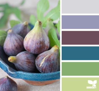
This is called Fig Hues from Design-Seeds. I love these colors, but Mr. H.C. doesn’t like blue…
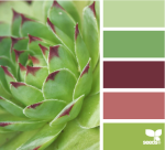
She takes colorful photographs–from nature, architecture, food, animals — and separates the colors for a palette. Here are four palettes that I particularly like for the living/dining area.

Tropical Greens. All these greens melding in nature — this is what I had in mind. I think the one shade of olive brown would have to be cinnamon though (for our leather couch…)
Planted Hues. Not sure about the light rose color here; it might work with our furniture. We have antiques.

Forest Tones. This is my current favorite. I love how all the greens go together, and there is the rust of our couch in there too.

Bamboo Tones. These three greens are quite nice together and the creamy color is very similar to the off-whites we’ve been using.
And so now, readers, we are doing some audience participation once again. Which of the above palettes is your favorite? Make your choice of the above palette by June 2nd, and, using your best words, say why you like it most. The loveliest worded entry will receive a FREE BOOK on decorating. (I get to pick the winner — it’s my blog after all…) The book is a copy of either Perfect English Farmhouse or Perfect English Cottage both by Ros Byham Shaw, and you can read my post on these books here. (One of the books belongs to my son-in-law, and he gets first dibs.)
Disclaimers:
- Please enter only once.
- This is a “like-new” book. I read it — hey, if you read my last post, you know why I’m having book giveaways…
- No one is responsible for this give-away but me, and no one is making any money on it, and I bought the book with good hard-earned money, and I’m paying the postage for the winner to receive it. :-)
- If you live outside the United States, it doesn’t decrease your chance of winning, but it does seem likely that you won’t get your book as quickly. (My son sent me a postcard from New Zealand in December, and I received it just a few weeks ago in April.)
- Choose your favorite palette below.
June 4, 2013 Oh, it was so hard to pick the winner — you all had such good comments, and lovely phrases. Thank you each one for commenting, and I wish I had a decorating book to send each of you. Full of Grace-DJ is the winner of Ros Byham Shaw’s book.

Hi There, I’ve voted for planted hues, mainly because I like these colours.
I’m decorating vicariously with you and so love your little house and its progression.
You’ll find as they are cool colours you’ll have an easier time blending the colours between the two rooms. The gorgeous green you have in your kitchen is a ‘cool green’.
( on the colour chart colours are either warm or cool, but I guess you know that by now).
I can see the pink/red tones working well with contrasting greens and creams as highlights. Which will give your dining/family room a very warm and welcoming ambience, cosy and comforting during the cold winters. Cant wait to see the next ‘episode’ in the blog to find out where you’ve gone with this room.
LikeLike
You’re right! I should go get a book on color with a color wheel (at a library!) I used to have one I loved that was half pages so the pages could be turned to see how the various colors looked with each other. Thanks for the idea!
LikeLike
I picked Planted hues and here’s why–that rose color. So calm and lovely. With the greens, those colors speak safe home to me. I have them all over my house! And when I was teaching, one year I painted my classroom that rose color with clouds on the ceiling. I then had the best teaching year of my life! It sparked energy and creativity in all of us.
PS: If I win, can I please have your kitchen instead? Thanks.
LikeLike
Ha! Made me laugh!
…but that’s very interesting about the rose color sparking creativity and energy.
And the rug we will be putting in one room or the other is very definitely greens, cream, and rose colors.
LikeLike
I am terrible with color but my first impulse was Forest Tone. I am going to hire you the next time I paint my house
LikeLike
You don’t have to hire me. Advice is cheap. :-)
LikeLike
I voted for forest hues because the tropical greens reminds me of the nasty fashions of the seventies and the planted hues reminds me of my own overdose of green and pink from the nineties! That includes the wedding and two, yes two, floral couches. Just can’t combine those again! However, my real favorite is the fig hues. I’m thinking you might be able to spin that blue shade into a blue GREEN tone and call the other shades for what they are, eggplant and grey. Its worth a shot, maybe? :)
LikeLike
Maybe, that blue is very greenish looking.
But the floral print in those dresses was so pretty! Wallpaper-ish, but that was the style!
LikeLike
I enjoyed all the “green” pictures. I’ve also noticed how the greens in nature are lighter in the spring than later in the summer.
LikeLike
Yes. And I wonder if it is the new leaves that look fresh and pretty… or the angled light of spring that makes the colors better. I’ve read that outdoor photographers like the light of spring and fall the best. It’s probably a mixture of both.
LikeLike
My husband and I recently purchased a 110 year-old farmhouse. Needless to say, we need to do a lot of painting. I would choose the “Forest Tones” color palette for our home. The light yellow reminds me of the sun beaming into our sunroom – warm, uplifting, and cheerful! I have always loved green paint colors as well (including your kitchen!). Green exudes a fresh, clean and calm feeling for me. Personally, I think this color palette is more earthy than the other palettes making it perfect for outdoorsmen like my husband and I. Thank you for sharing the links! Love this post!
LikeLike
I actually signed up for a Design-seeds email. Every morning I get a burst of lovely color in my inbox! Today she sent one called Forest Hues, and if you like greens, you should definitely check it out. It’s gorgeous! And how wonderful to have an old farmhouse. I’m jealous… :-)
LikeLike
When I first read this, my choice was Planted Hues, but those rose hues are looking much more pink on my laptop… So my final choice is Forest Tones. I’m thinking that this could be a wonderful choice for Apple Hill Cottage as the colors remind me of an apple tree covered in creamy blossoms. That color scheme also seems to go well with Blooming Grove. You could add some pops of apple red as an accent color with this scheme–for fun, and because red and green are complimentary colors.
But really, I think you should go with whatever colors you enjoy the most! Have fun!
LikeLike
Yes, there is definitely a difference between pink and rose. Although my sister says you can never pick colors from a computer!
“an apple tree covered in creamy blossoms” — you must be a poet! :-)
LikeLike
I love the colours within the Forest Tones; they feel very fresh and spring-like. Just as spring is a time of re-birth, Apple Hill Cottage has been undergoing a re-birth of its own also. The Forest Tone colours also relate to the period of your Cottage and will highlight the details of the interior in its truest form. Plus I just think these colours are the happiest!
LikeLike
I think they are happy too — and green has always been the color I am drawn to. It’s another plus (I think) that the the original wall color — when we finally get down to it — is always a shade of green or tan. (Although I must admit the bathroom door was a deep shade of pink!)
LikeLike
Interesting you should say that about green because recently we tore down a wall in our 100+ year old home and guess what colour the original plaster was?? Green!
LikeLike
Beautiful pictures!Our house is moltsy surrounded by pines, so we don’t get such great color. I miss it. But I also like having the green of the pines through the long winters.
LikeLike